

pAIwares
Merchant Onboarding Design (SaaS)
1-week UI sprint to deliver a polished, interactive onboarding prototype for a client-facing sales demo.
Role: Solo UI Designer | Tools: Figma | Timeline: 1 week
Users
Banking associates onboarding merchants to streamline client accounting + merchant services setup
Deliverable
Clickable prototype demonstrating onboarding forms, catalog selection, and confirmation states
Streaming/Media Relevance
Partner onboarding thinking (creators/advertisers) — clear requirements capture, guided progression, and trust-building confirmations.
The Challenge
pAIwares needed an onboarding experience that could capture merchant and transaction setup details clearly enough to support real-world use, but polished and coherent enough to function as sales demo material.
The client provided sketches and layout concepts, but there wasn’t an existing onboarding flow to iterate on. This sprint focused on translating those inputs into a complete, interactive prototype — defining the information hierarchy, step progression, and interaction patterns needed to communicate a “shippable” product experience.
The Solution
A streamlined onboarding flow that enables users to enter merchant business and transaction details, select relevant products/services, and complete submission with clear confirmation and next steps — supporting a self-explanatory demo narrative.
Approach
Stakeholder interviews: scoped needs, clarified product context, defined success, and prioritized demo-critical screens.
Requirements translation: Converted client sketches and matrixes into functional UI components — aligning input types, groupings, and layouts to required data constraints.
Prototyping: designed a structured onboarding flow with clear information hierarchy and predictable interactions.
Field requirements matrix
Stakeholder Input
This sprint was execution-focused: the client provided sketches and requirements matrixes defining the flow, required fields, and demo goals. My role was to translate these inputs into a polished, clickable Figma prototype — standardizing layout, defining interaction behavior, and ensuring the onboarding story reads clearly without facilitator explanation.
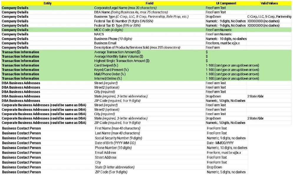
The matrixes defined required inputs, formats, and allowed values across company details, transaction info, addresses, and contacts.
I used it to drive information grouping, input types, and patterns in the prototype.
Step-based progression

The stepper established where the user was in the flow and what remained.
Partner tools often depend on “missing requirements” visibility to prevent stalled activation.
Catalog selection sketch
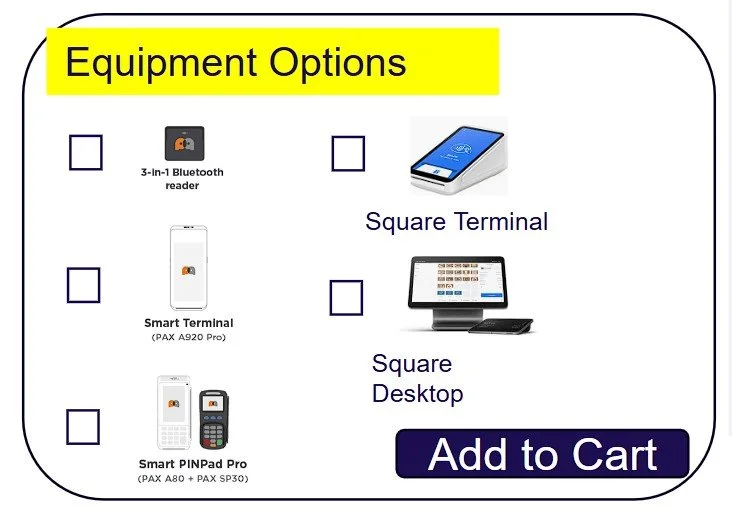
The catalog defined a multi-option configuration pattern with checkboxes, product visuals, and a clear commit action.
I translated this into a consistent card layout with predictable selection behavior to make configuration obvious and reviewable during the demo.
Confirmation states
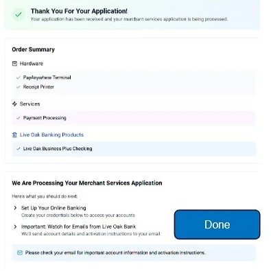
Confirmation states were drawn to reassured the user, summarized selected hardware/services, and communicated what happens after onboarding.
Confirmation is a high-stakes moment in onboarding, clarity here would reduce uncertainty and improve completion confidence.
Constraints
1-week turnaround
No end-user access (no usability testing during this sprint)
No prior Figma foundation — designed from scratch
Stakeholder-led revision list requiring rapid iteration
Tradeoffs
Prioritized demo-critical path over edge cases
Optimized for clarity over density
Structured form hierarchy
Grouped inputs into scannable sections based on the requirements matrix to reduce re-reading and missed fields.
Key Implementation Decisions
Step-based progression
Implemented a consistent stepper and CTA pattern so the flow is self-explanatory in a sales demo (clear “where am I / what’s next”).
Catalog selection pattern
Translated the equipment sketch into a card-based selection experience with a clear commit action (“Add to Cart”) to make choices obvious and reviewable.
Confirmation states
Designed confirmation states that summarized selections and communicated next steps, reducing uncertainty.
Full Onboarding Flow
-
![]()
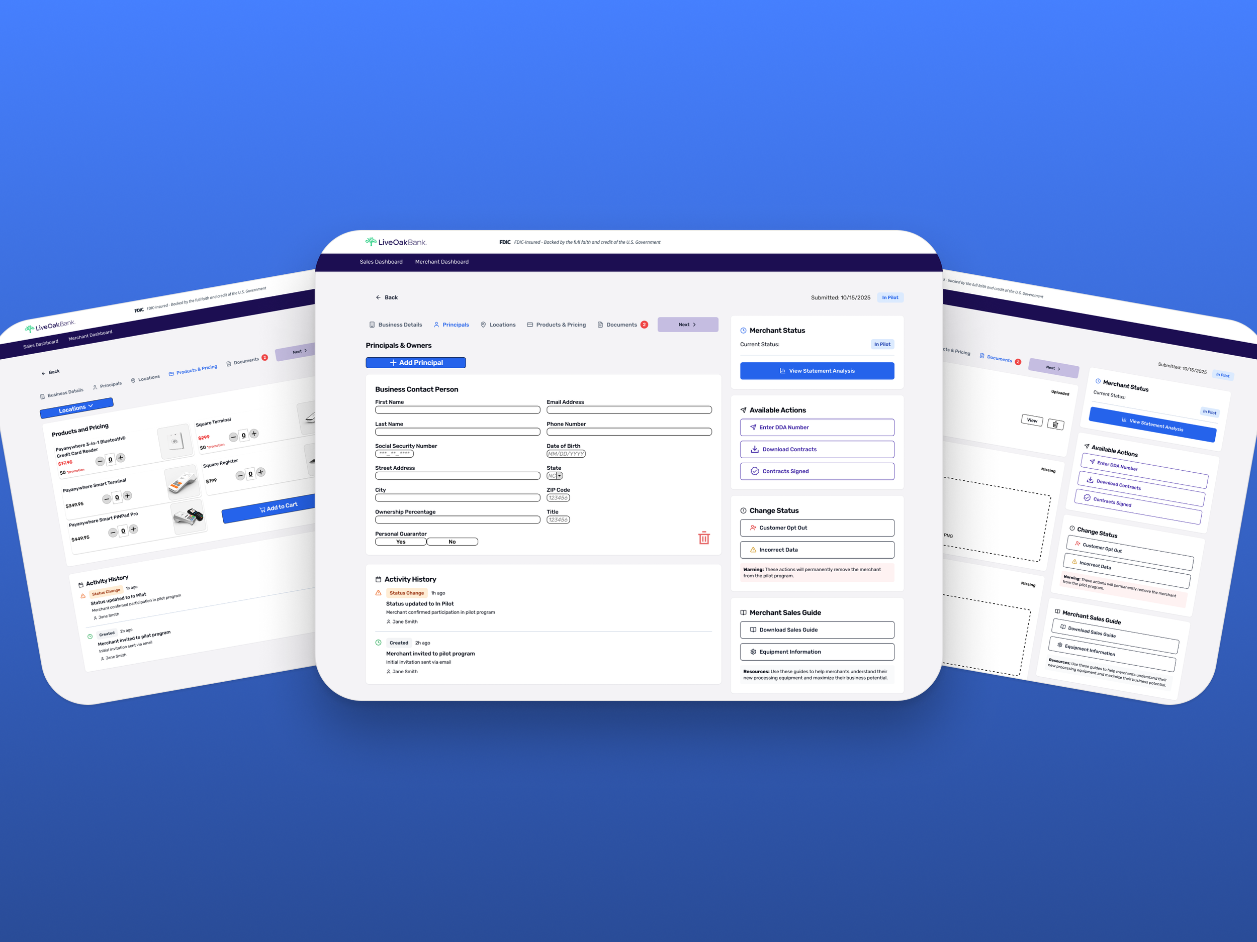
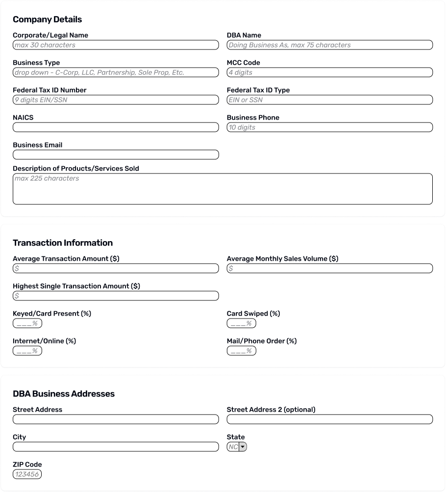
Business Details (Onboarding Step 1)
Captured required company and transaction inputs with grouped sections and helpful placeholder text.
-
![]()
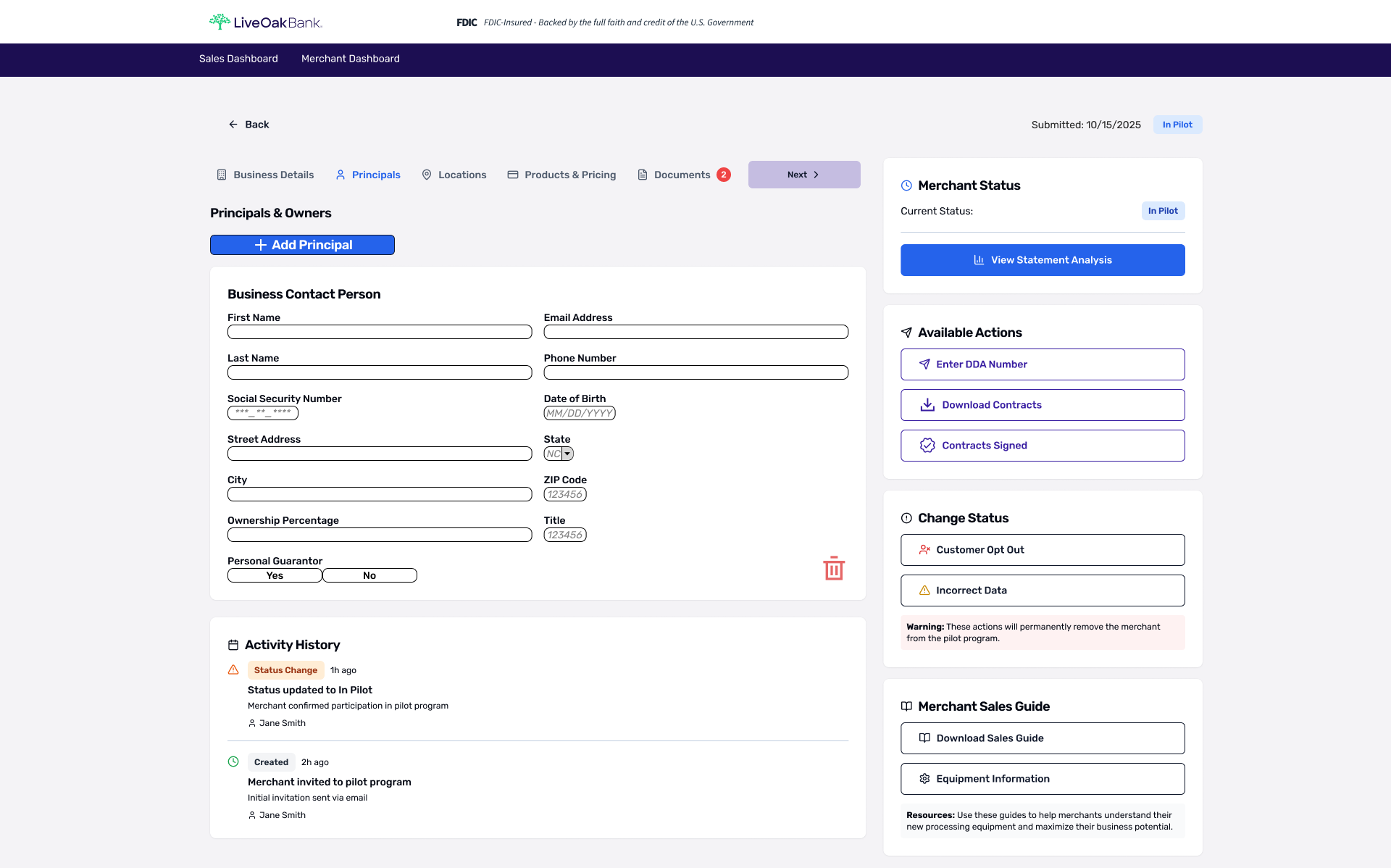
Principals (Onboarding Step 2)
Captured owner/principal details required for underwriting and compliance in a structured, scannable form. Included Add/Remove principal controls to support businesses with multiple owners.
-
![]()
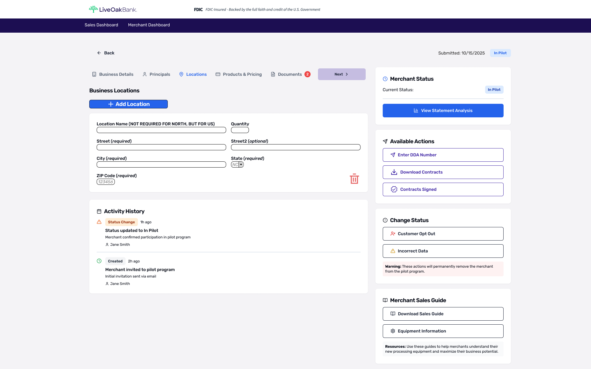
Locations (Onboarding Step 3)
Supported multi-location merchants with a simple “Add Location” pattern and clearly labeled required vs. optional fields. Enables quick edits without breaking the onboarding flow.
-
![]()
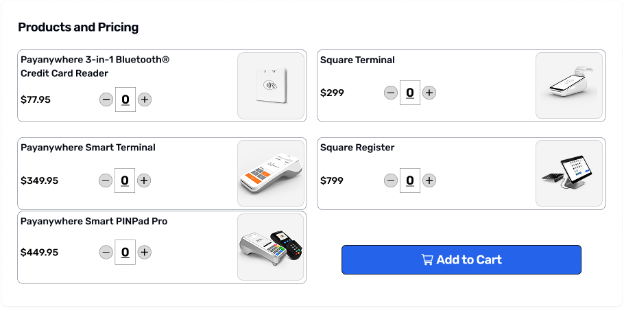
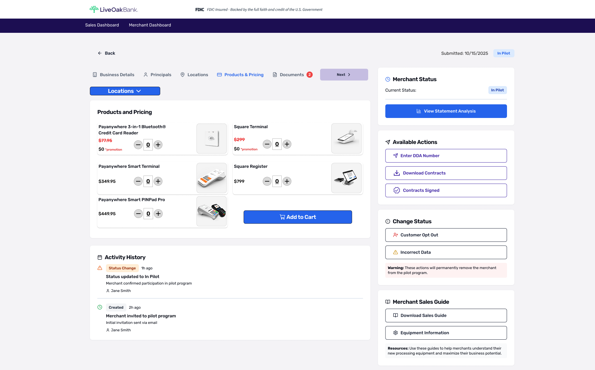
Product & Pricing (Onboarding Step 4)
Select hardware/services with quantity controls and a clear “Add to Cart” action, supporting a sales-ready walkthrough.
-
![]()
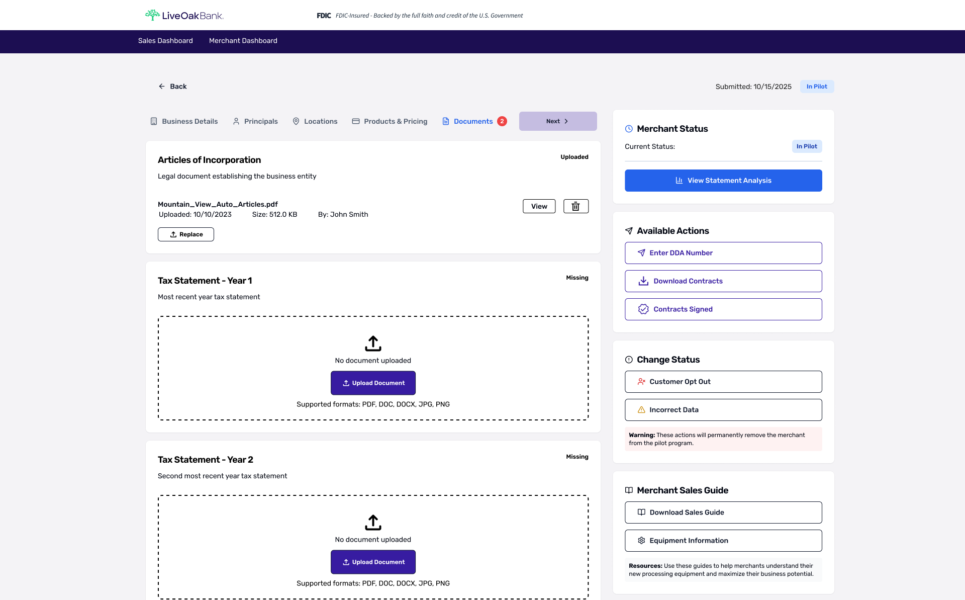
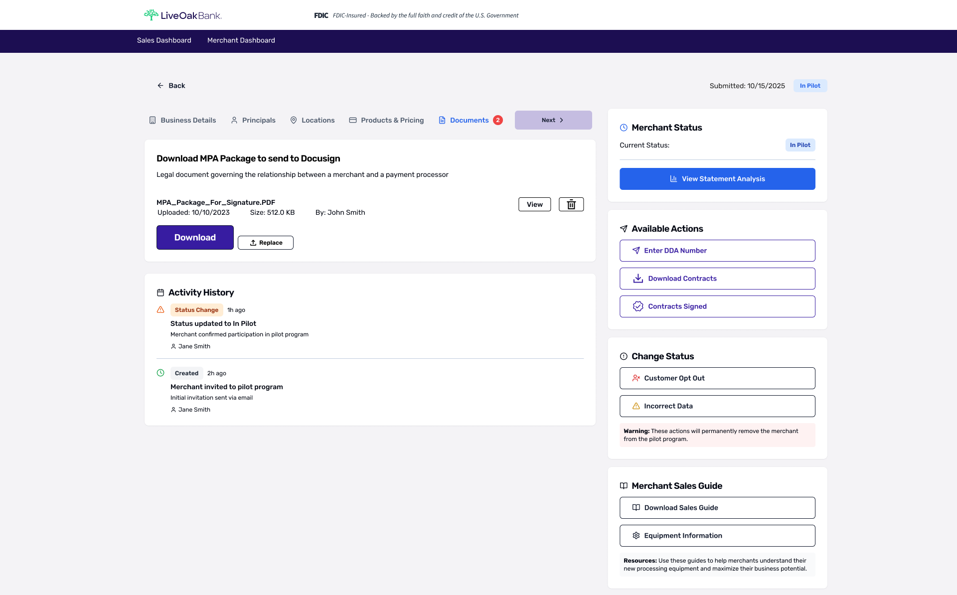
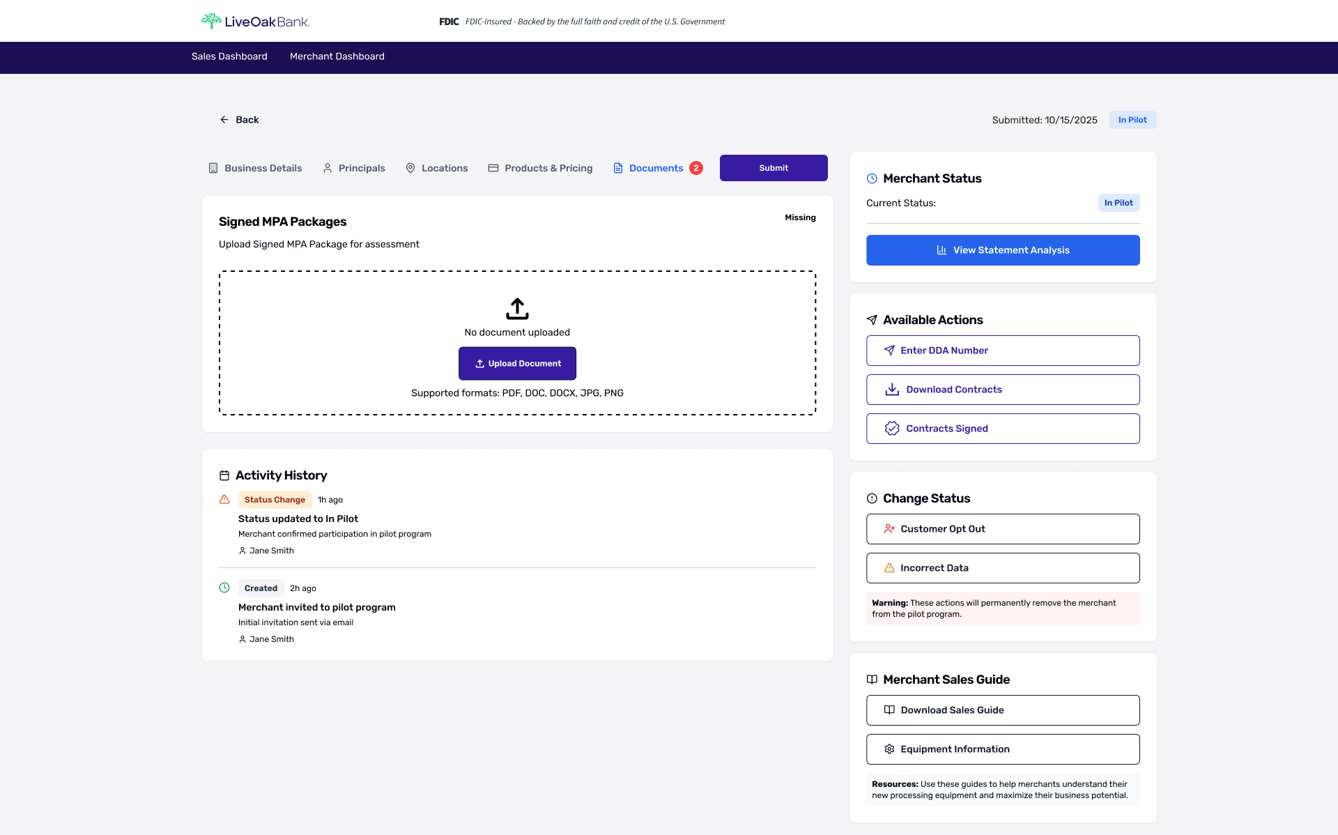
Documents (Onboarding Step 5)
A document requirements checklist that makes completion status explicit (“Uploaded” vs. “Missing”) so users knew exactly what’s left. Uploaded items display metadata and quick actions (view/replace/delete), while missing items use an obvious upload drop zone.
-
![]()
Download Contracts (Onboarding Step 6)
Provided the correct contract package for signature with clear file metadata and quick actions. Designed to reduce friction when sending the package to e-sign tools.
-
![]()
Contracts Signed (Onboarding Step 7)
Guided the final submission step by requesting the signed package with supported file types and a prominent upload drop zone.
-
![]()
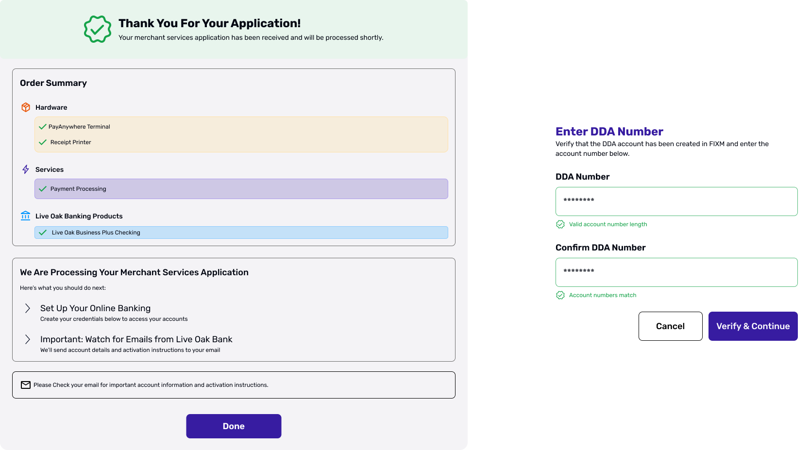
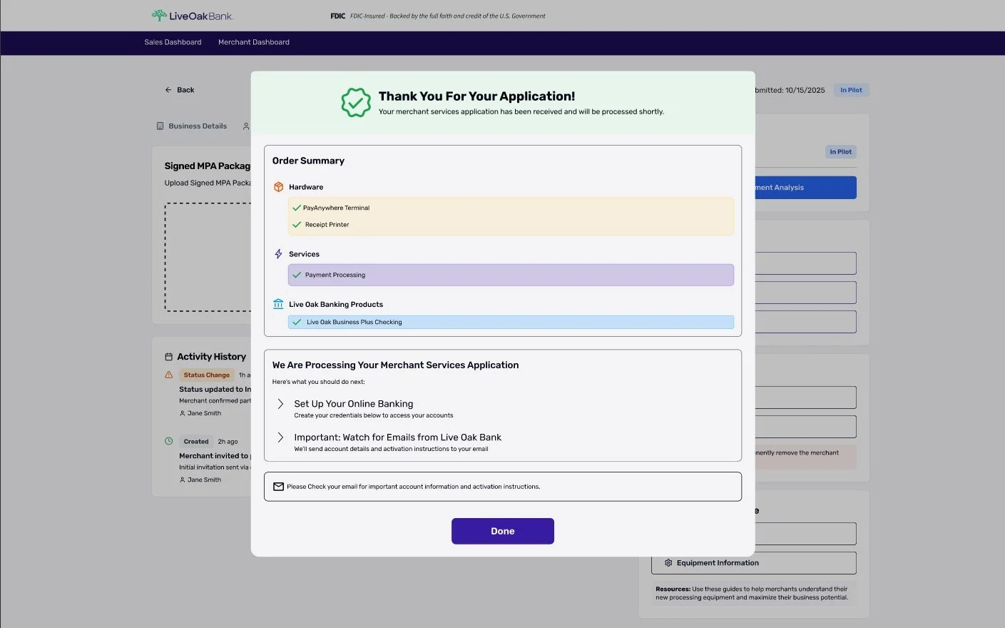
Application Submission (Onboarding Complete)
Summarized selected products/services and provided explicit next steps to reduce post-submit uncertainty.
Outcome
Delivered a demo-ready onboarding prototype that defines step progression, standardized form hierarchy, configuration selection, and confirmation states.
Enabled clearer sales conversations with prospects and improved cross-functional alignment by providing a shared reference for stakeholders and development.
Next Steps (Validation Plan)
5-user usability test on onboarding completion (completion rate, time-on-task, comprehension).
Add more input validation + error states (format guidance, required fields, inline feedback).
Confirm whether the sales dashboard requires filtering/sorting rules for real operational use (beyond demo).