Solace
A curated tool to fit your personal emotional needs
Mobile App MVP UX/UI Design Case Study
Overview
Solace was the capstone project of Noble Desktop’s UX/UI Design Certificate Bootcamp. This project was an in-depth exploration of the UX design process.
Our team designed the Solace mental wellness app by focusing on creating a user experience that cultivated emotionally positive and personally unique support. The project involved a comprehensive design aimed at making mental wellness resources more accessible and curating tools to accommodate user's specific personal needs. Through user research, prototyping, and usability testing, I played a key role in creating a solution that resonated with our users.
Problem
Therapy clients transitioning to a more independent maintenance style needed supplementary support as managing their mental health required more accountability and had a higher risk of regression into negative coping habits.
Solution
We designed an emotionally supportive and highly personalized mental wellness tool, that seamlessly guided users toward relevant wellness techniques tailored to their specific individual needs.
Our Design Process
Designing Solace was a exploration in problem-solving fueled by research and driven by pinpointing the gap in the journey towards positive mental health.
Explorative Research: We explored the mental health space to find friction points and to understand people’s current solutions as they moved to a more independent management system.
User-aligned Structure: With our research, we found the problem we wanted to solve and came up with a potential solution. We gave it structure with a user flow and mapped out each section of the solution our users would experience. From there, we crafted user stories to accompany each section and to tie them back to the user’s goals at every step along the way.
Visual Design: Building on the content from our user flow and user stories we visualized our solution with low fidelity wireframes and concreted the shape of the experience.
Prototypes & User Testing: Fleshing out the wireframes into functioning interactable prototypes, we tested our solution to validate if we solved the right problem and if we solved it the right way.
Understanding Transition Phases and Therapy Clients
We came into the project with the assumption that many people make progress in therapy, but struggle to maintain it when sessions become irregular or end. We wanted to explore that space where managing your mental health become more independent, requiring more accountability, and where people became more susceptible to early dropout or relapse into unhealthy habits.
“How can we better support individuals through psychological transitions to improve long-term therapy outcomes?”
Target Audience
Demonstrated commitment with 6 months of meaningful engagement with therapy.
Built a therapeutic relationship, developed emotional insight, and practiced coping strategies.
Are now transitioning to irregular sessions.
Interviews
I conducted interviews with therapy clients to uncover their experiences related to the therapeutic process and how they handled their mental health after transitioning to less frequent sessions. Participants were selected based on their experience and commitment to the process of traditional mental health therapy, allowing us to gather a diverse range of insights.
The primary goal was to understand therapy clients and this transitional phase in their mental health journey.
Research Goals
Explore what helps people sustain their progress after therapy
tools
routines
support systems
pain-points
Identify contributions to long-term mental wellness post-therapy
behaviors
mindsets
habits
current management systems
Surveys
Alongside interviews, I created a survey to identify general trends, common tools used, and emotional challenges post- therapy.
The survey aimed to quantify user experiences and gather feedback. This gave our team broad insights on users' mental health journeys, supplementing research from the interviews.
Analyzing the data helped shape the direction of interview questions and identify emerging patterns in users' mental health journeys, guiding our design decisions effectively.
Research Insights
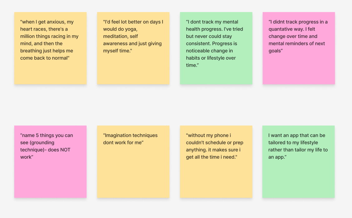
Comparing internally who they were to who they are now was the preferred method of mental health progress tracking.
Feeling the body, breathing, being emotionally aware, and affirming self-talk are beneficial to mental health.
Relief comes through tangible, not abstract, tools. Imagination based methods and journaling feel ineffective. Grounding only works when it’s active and practical reflection needs to be felt, not forced.
Support comes through Intentional tech use. Technology is a lifeline for structure and learning, not just distraction. Users want tools that adapt to their needs, helping them grow without taking control.
Getting To Know Our User
We developed a user persona based on the research findings focused on common characteristics, needs, goals, and frustrations. This persona helped us empathize with our users and tailored the app's features to meet their needs effectively.
Our Potential Solution
Our research gave us insight into what the problem was, but also what the potential solution could look like:
practical & tangible relief techniques
a space to accurately track & reflect on mental health progress
a tool that aligns with users’ individual needs
Our persona showed us who we were designing for, what their goals were, and where they needed help in trying to achieve them:
needed in-between, supplemental support
wanted to be happy & emotionally balanced
struggled with managing their mental health on their own
We believed that providing them with an emotionally supportive and personalized mental wellness tool, therapy clients experiencing transitions into infrequent session cycles would achieve greater emotional resilience, better retention of therapeutic progress, and reduced risk of regression or disengagement.
The Journey To Emotional Support
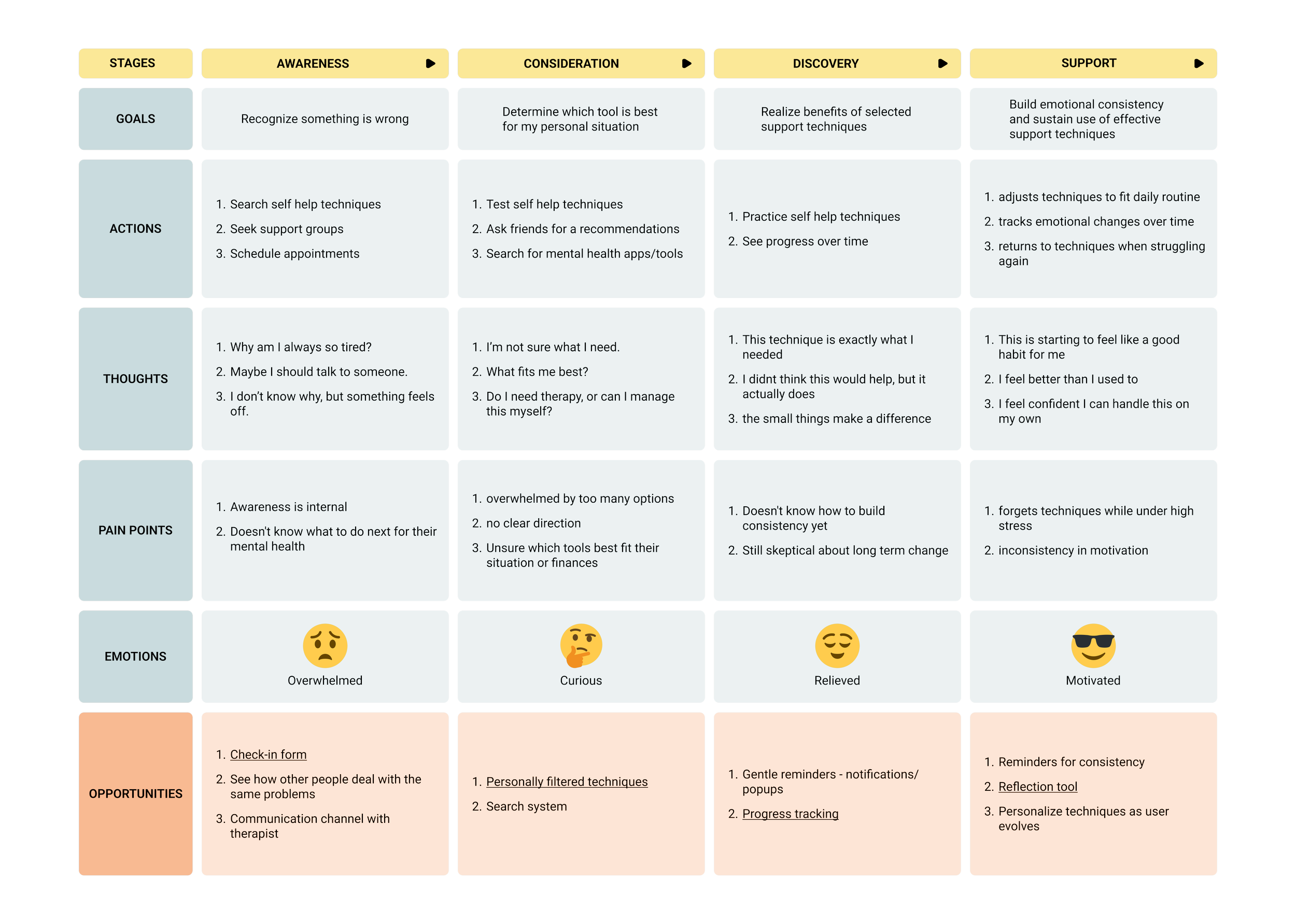
The journey map details the steps from emotional awareness to reaching the support users need. We used this to initially visualize the user's general experience with mental health tools.
This would help us make informed decisions about the flow of Solace; identifying user's goals, frustrations, and opportunities to explore at each stage in their experience.
We focused some of the opportunities into potential features to explore that would help our users reach their goals at every step.
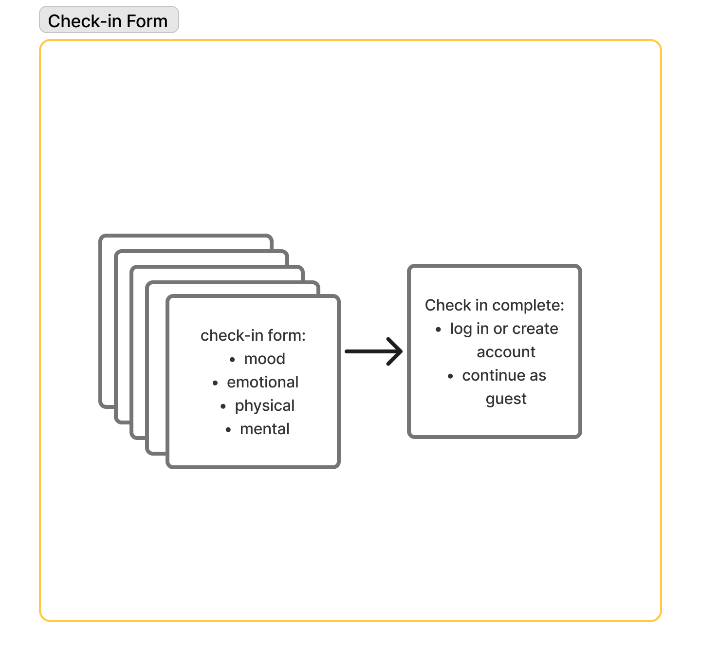
Check-in form
Progress tracking
Reflection tool
Personally filtered techniques
Competitive Analysis
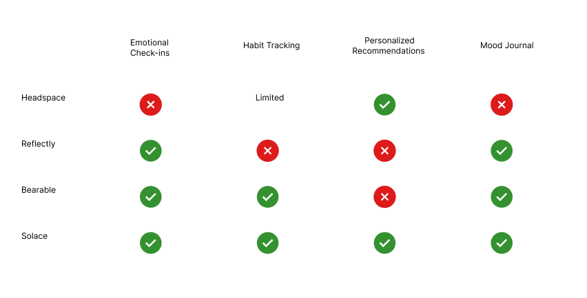
We conducted competitive research to gain insights into the features and solutions of our potential competitors. Identifying some of our direct competitors was the first step. Then we created a comparison matrix based on the features that we believed benefited our users the most.
The matrix showed us the potential gap in the market for a solution like ours.
Broadening our perspective
We realized after comparing across other forms of mental health tools that our product could be beneficial to a wider audience.
Mental health is universal!
Regardless of therapy experience, many individuals who share the same characteristics as our user and interested in maintaining their mental health could see value in our solution.
Structuring Our Solution
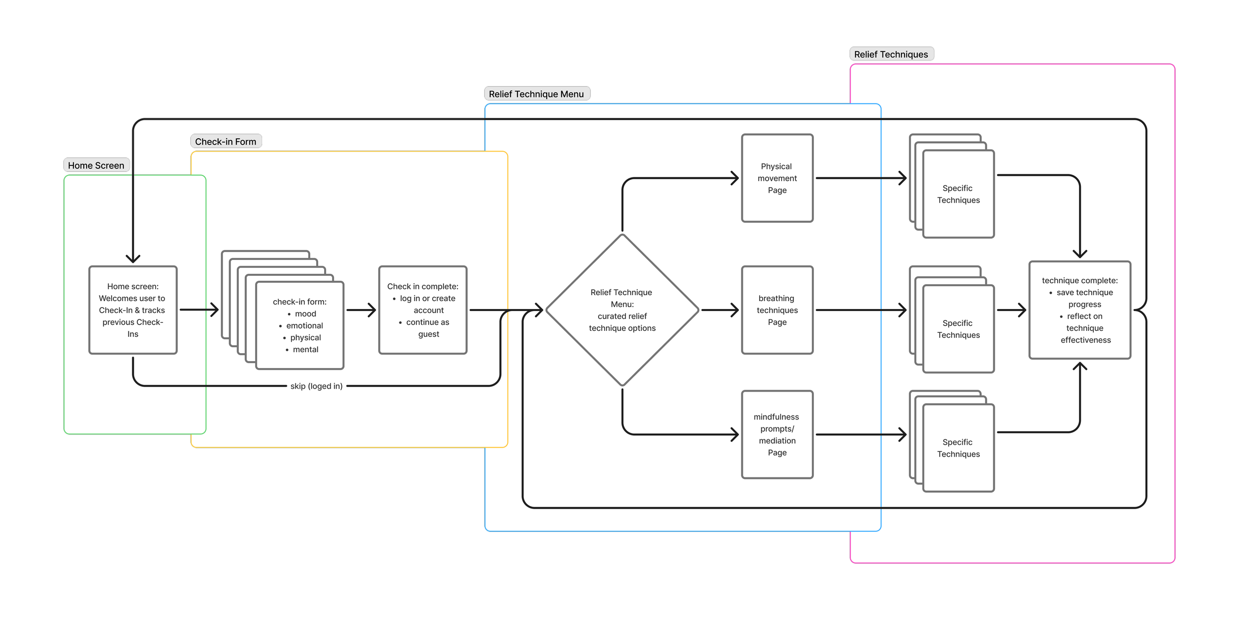
We created a user flow to map out each stage of the user's experience with Solace.
Here, we realized the general shape of the design.
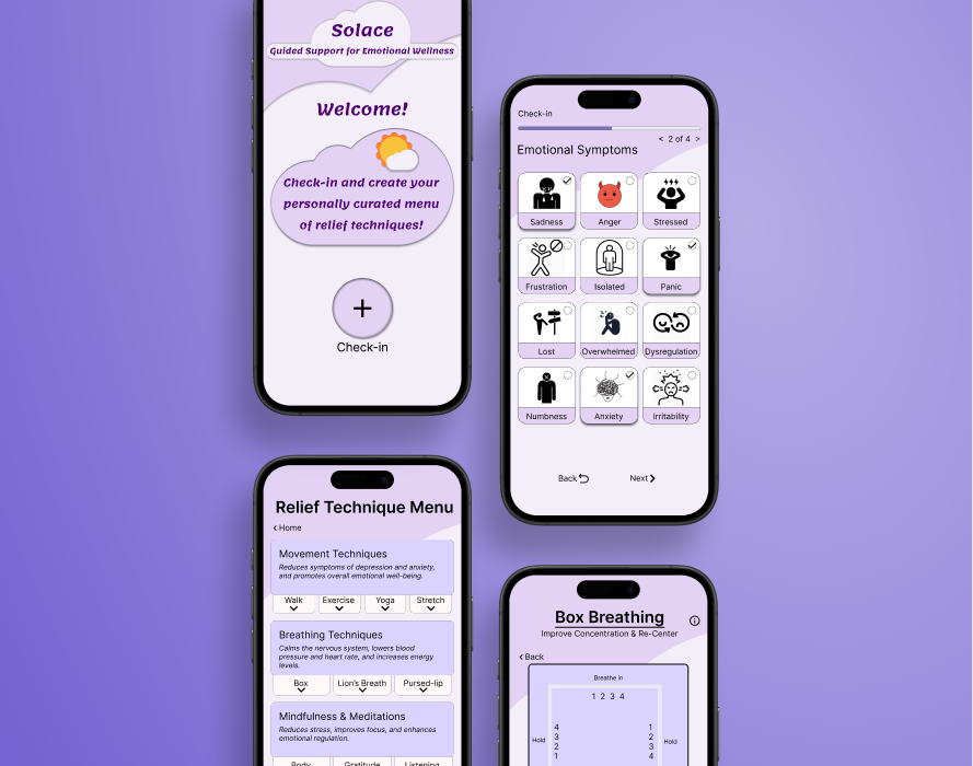
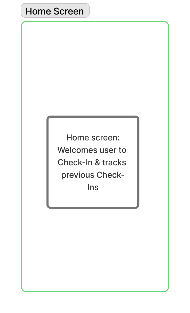
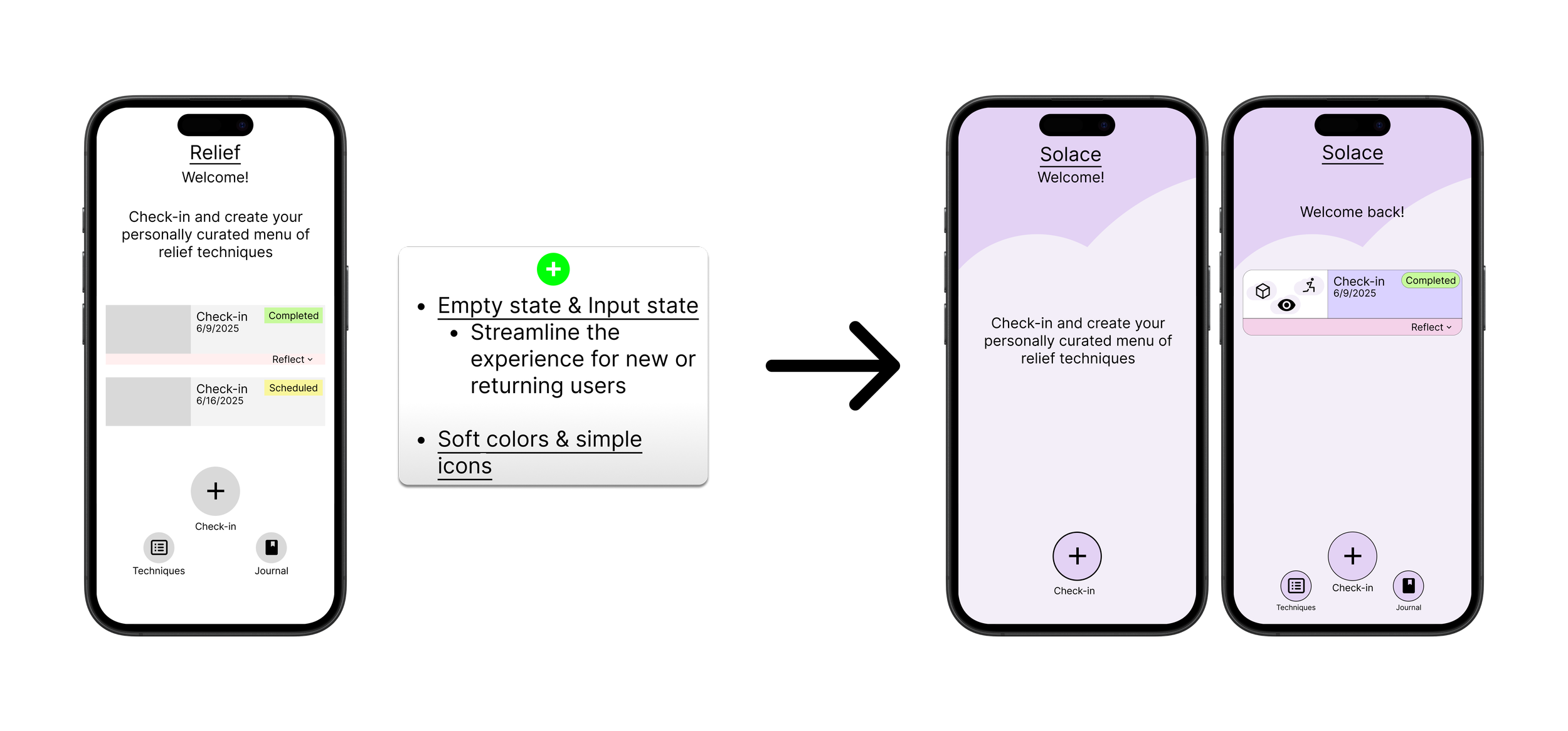
Home screen - The central hub for users to navigate from and record their progress.
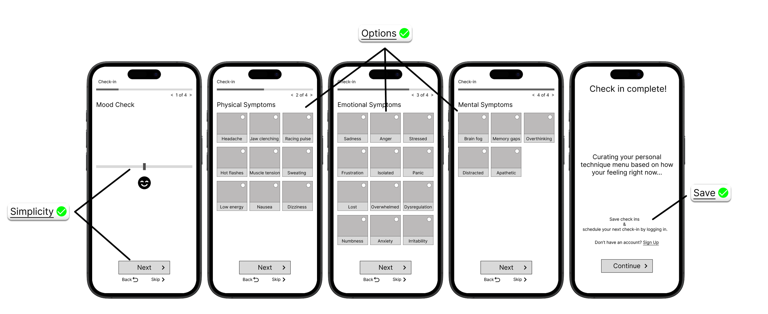
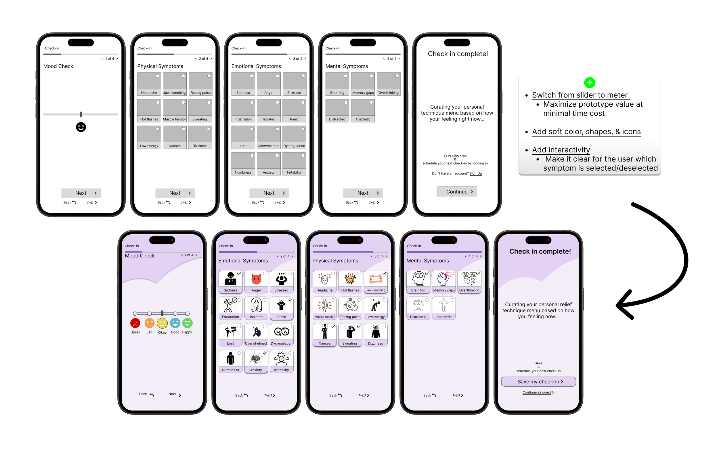
Check-in Form - Matched the app's awareness to the user's.
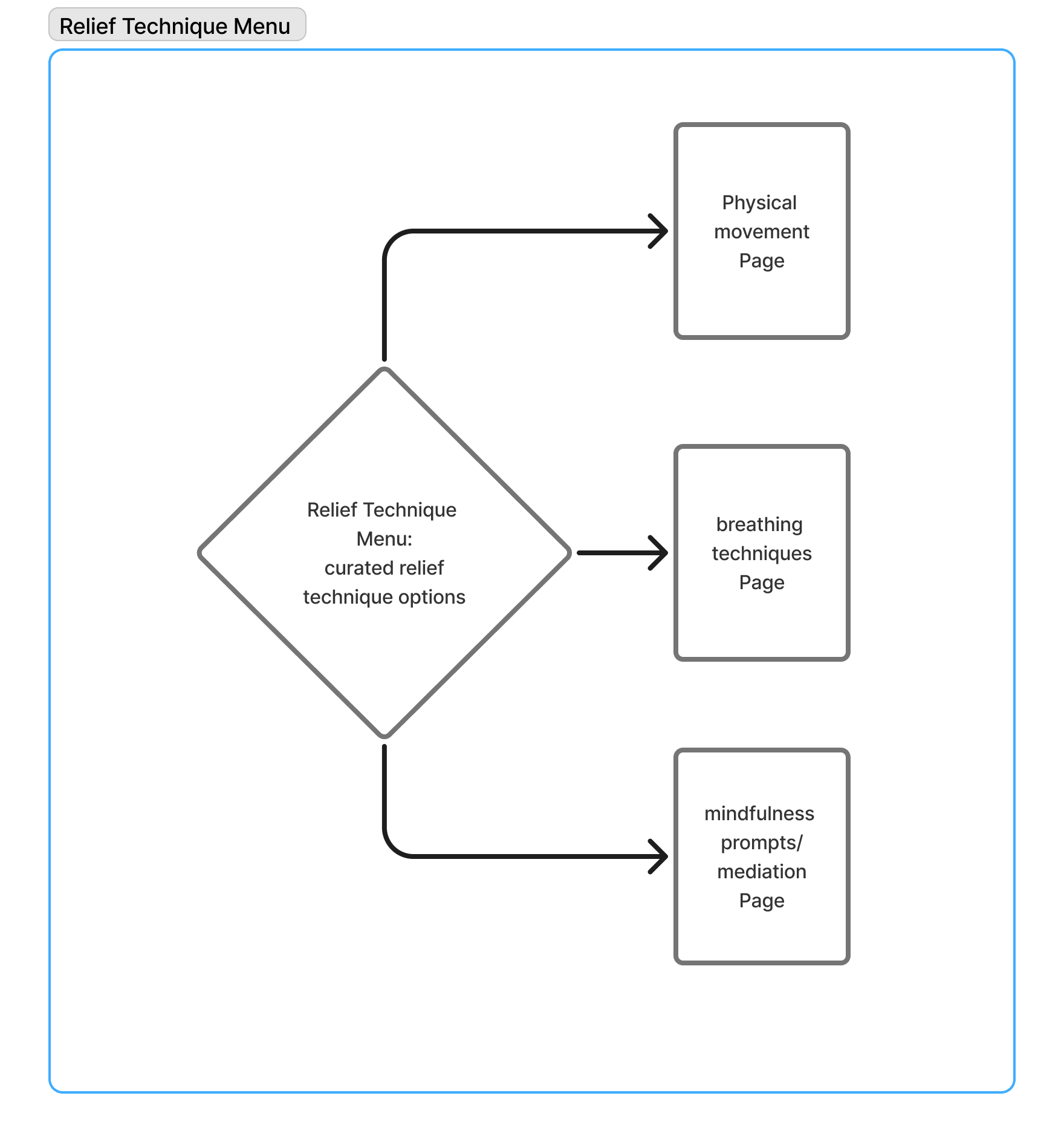
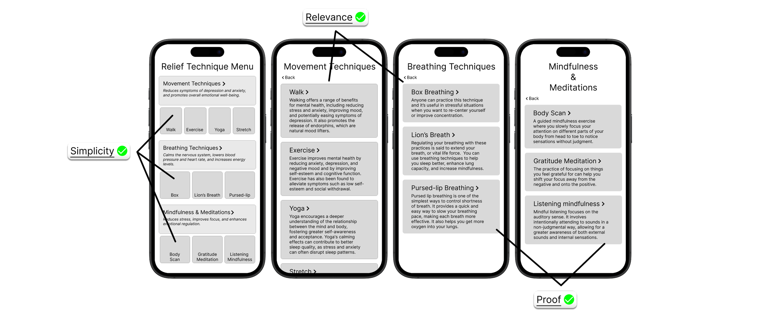
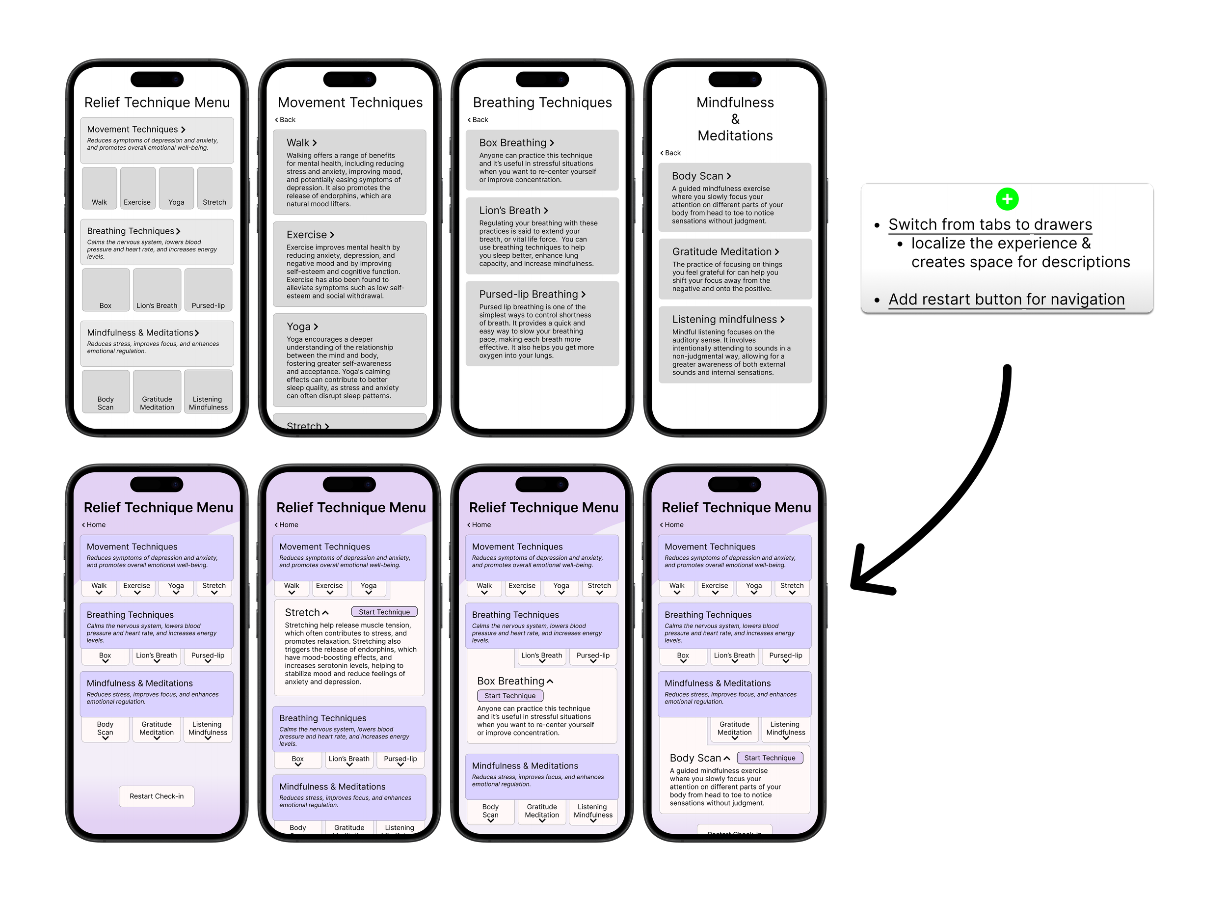
Relief Technique Menu - Sorted and curated list of wellness techniques based on Check-in responses.
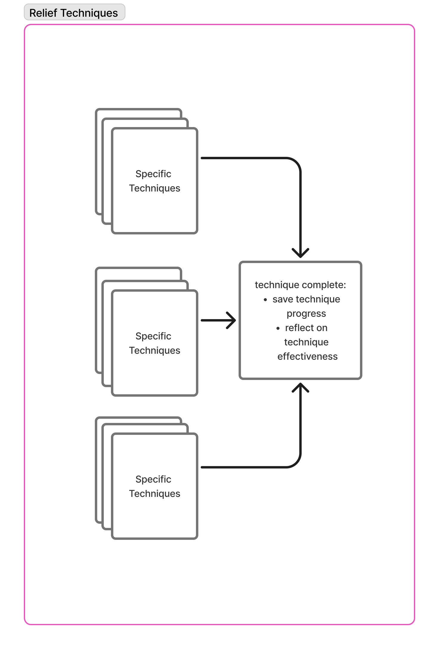
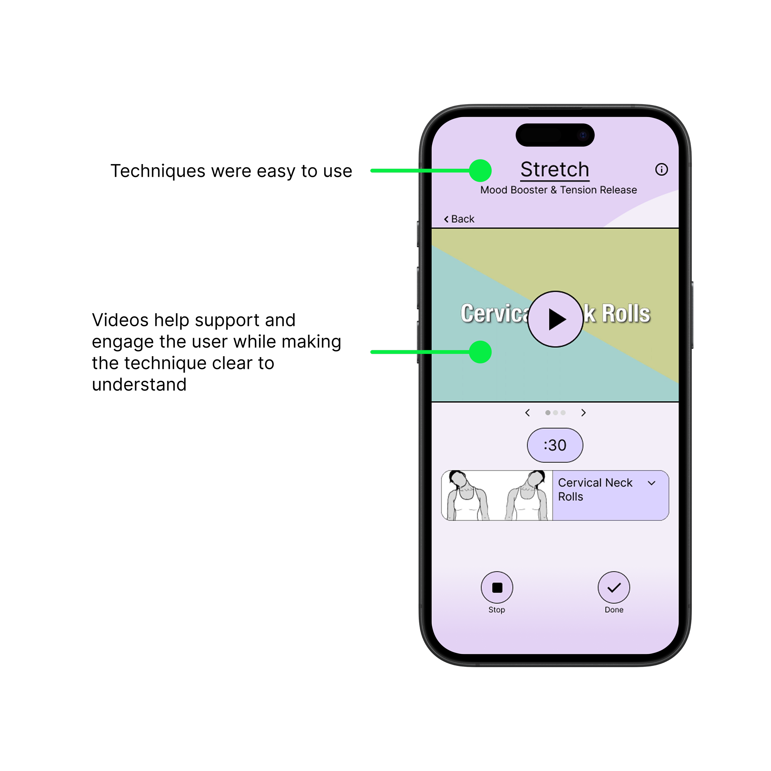
Relief Techniques - Various wellness techniques categorized by style and benefits.
This laid out a loop where we could test some of the features in a single experience for whether or not we were designing the right solution to fit our users’ needs.
Design Checkpoints
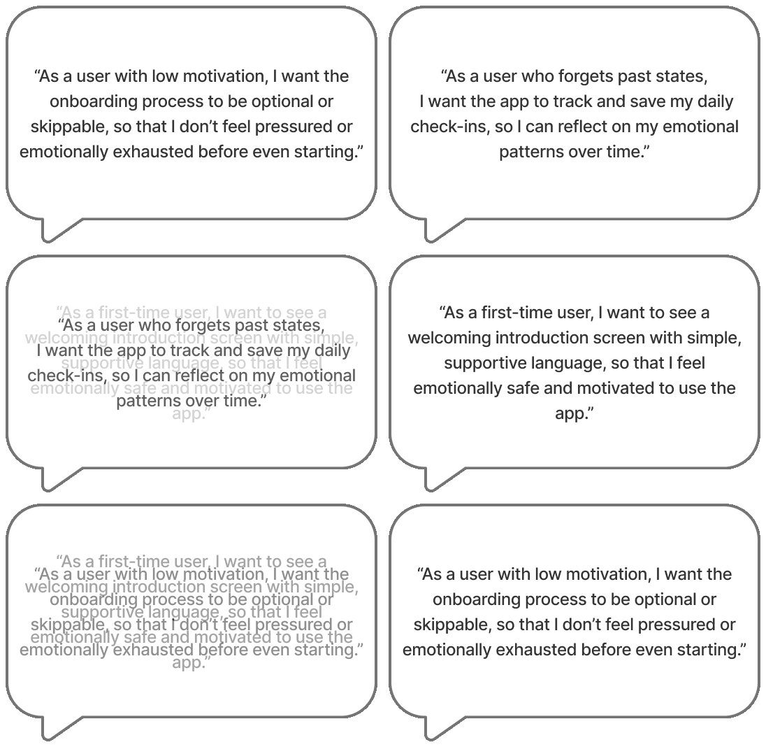
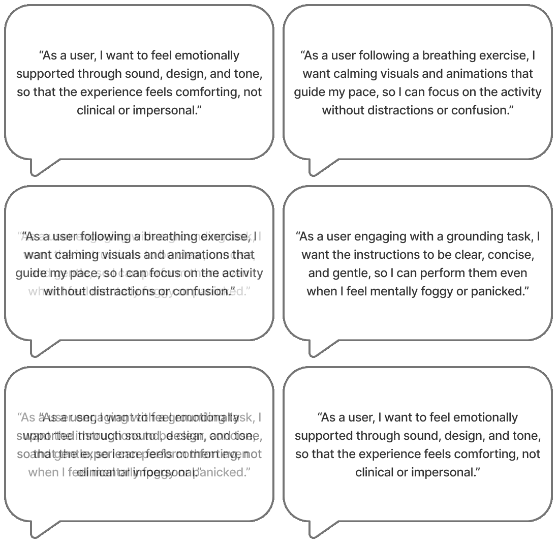
We created user stories as a way to fill out the details of each section so that each screen met users’ needs and expectations. It gave us a checklist to design from when we moved to wireframing.
Design Checkpoints for the Home Screen
Tone - welcoming & supportive environment
Reminders & Scheduling - accountability, consistency, & engagement
Flexibility - ease of use & personalized feel
Design Checkpoints for the Check-in Form
Simplicity - as easy & straightforward for the user as possible
Options - users want to feel seen & understood by the app
Save - users want to actually see progress over time
Design Checkpoints for the Relief Technique Menu
Relevance - users want techniques that actually work for their expressed concerns
Simplicity - avoiding analysis paralysis
Proof - users want to know why a technique is beneficial to them
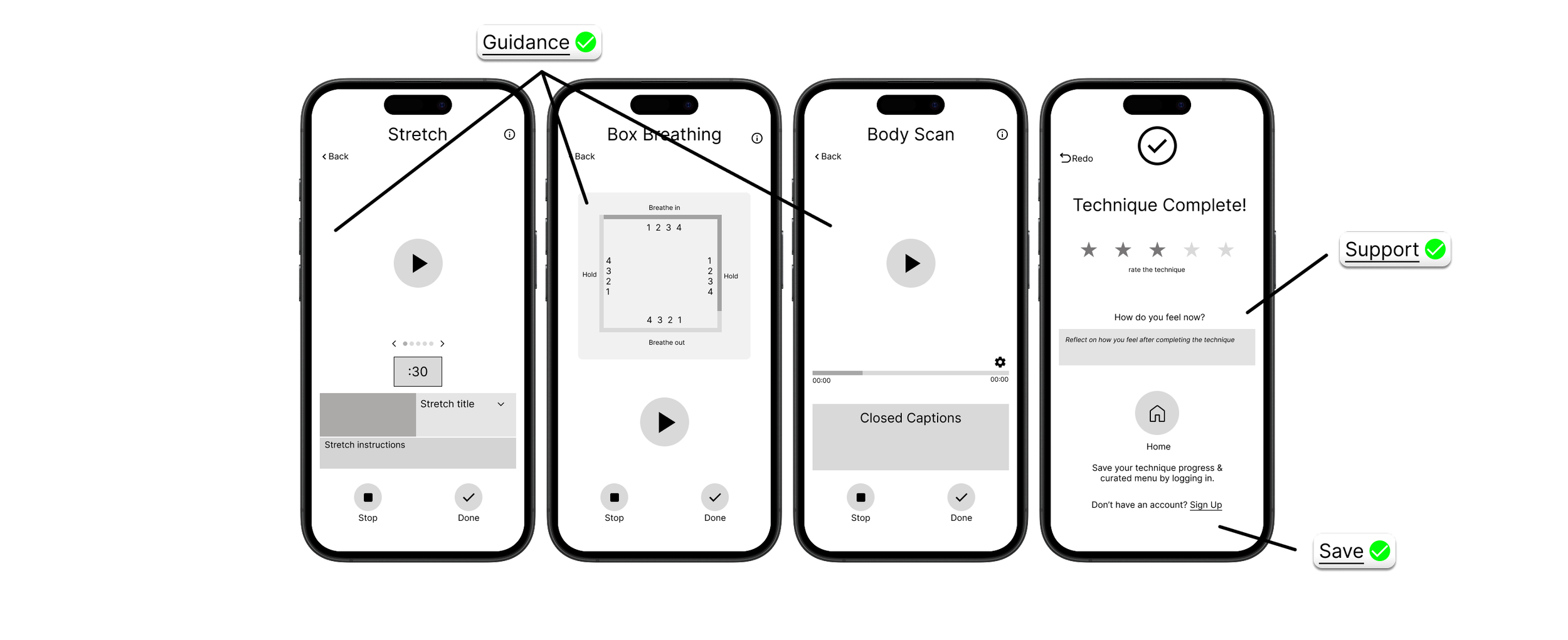
Design Checkpoints for the Relief Technique Screens
Support & Tone - users want a safe space to practice and learn techniques in vulnerable state
Guidance - users find it best when a visual aid is present to teach them how to perform the technique
Visualizing Our Solution
During the wireframing process, I translated concepts into layouts. The checkpoints from the user stories gave us flexibility in this stage while keeping us aligned with our users.
I specifically sketched the relief techniques to later validate if these types of techniques were valuable to our users.
Prototyping
The mid fidelity decisions were crafted to align with our brand identity, using soothing colors and gentle guidance. I focused on creating a visually calming interface that encourages users to engage with the app's resources. The design aimed to reflect the app’s mission of providing support and fostering emotional awareness.
Usability Testing
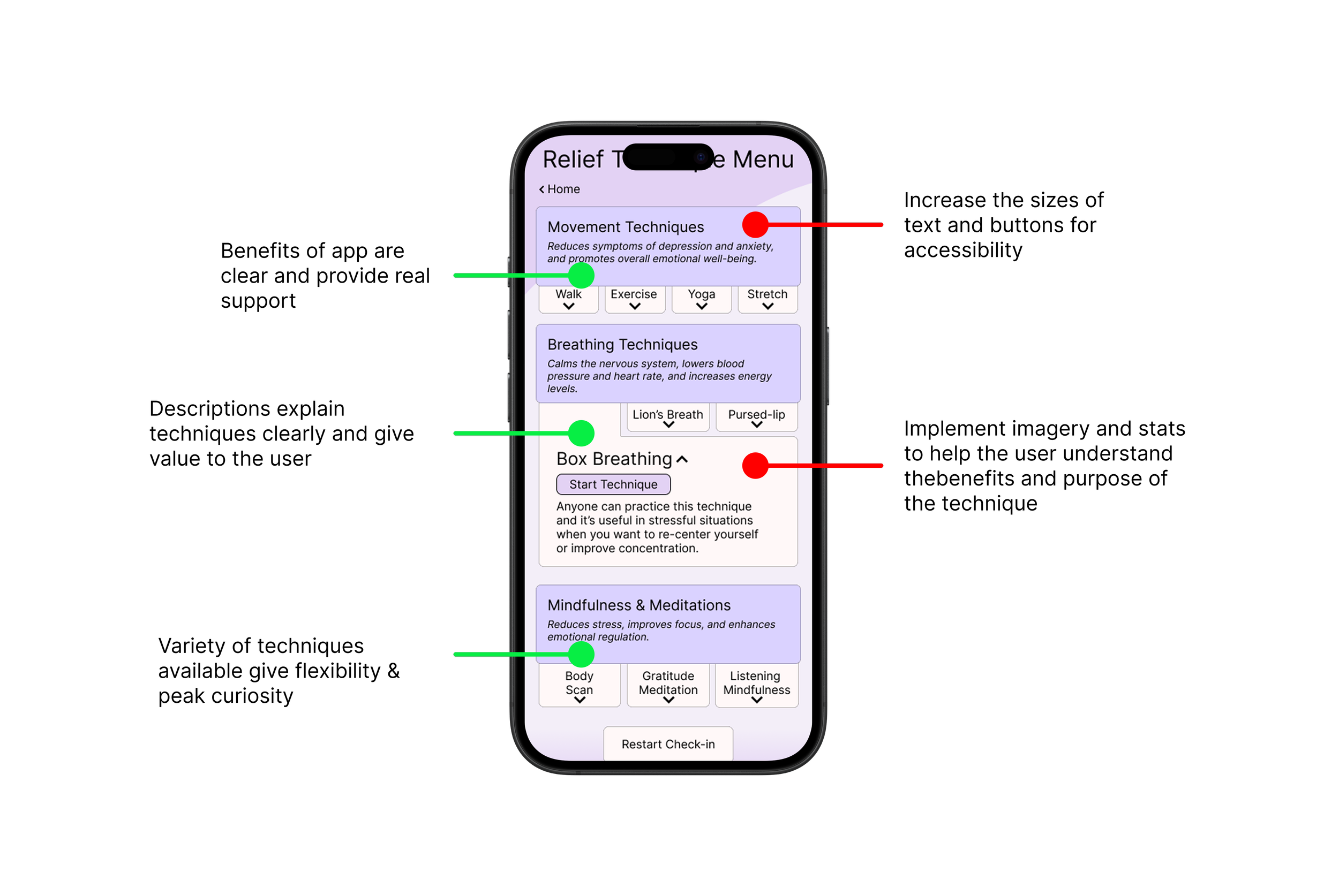
We conducted usability testing with a group of users to evaluate the app's effectiveness. The focus was on identifying areas of confusion, validating/invalidating our assumptions, and gathering feedback on the overall experience.
Assumptions to validate
Users want a tool that is personalized to their specific needs
Users want to feel supported as they complete relief techniques
Users want to know why a technique was recommended and what are the possible benefits
Users want a simple design so that every choice is easily made
Testing specific relief techniques
Are they useful?
Are they intuitive and easy to use?
Testing navigation
Is it clear how to get from one screen to the next?
Does the user understand what to do and where to go on every screen?
Reflection & Iteration
This was my first project going from abstract research to a concrete solution, fully immersing myself in the complete design process.
In regards to design, this project was like putting glasses on for the first time. Eye opening to say the least. I learned about the testament of research in creating effective and impactful designs, the power of collaboration, and the dedication necessary in bringing a project to fruition.
With respect to mental health, I learned taking care of yourself is such a personal and intimate experience, everyone does so in their own unique way. It takes commitment and accountability to be a better person than you were yesterday, and it takes courage and maturity to know when you need help.
With respect to mental health, I learned taking care of yourself is such a personal and intimate experience, everyone does so in their own unique way. It takes commitment and accountability to be a better person than you were yesterday, and it takes courage and maturity to know when you need help.
Next Iteration
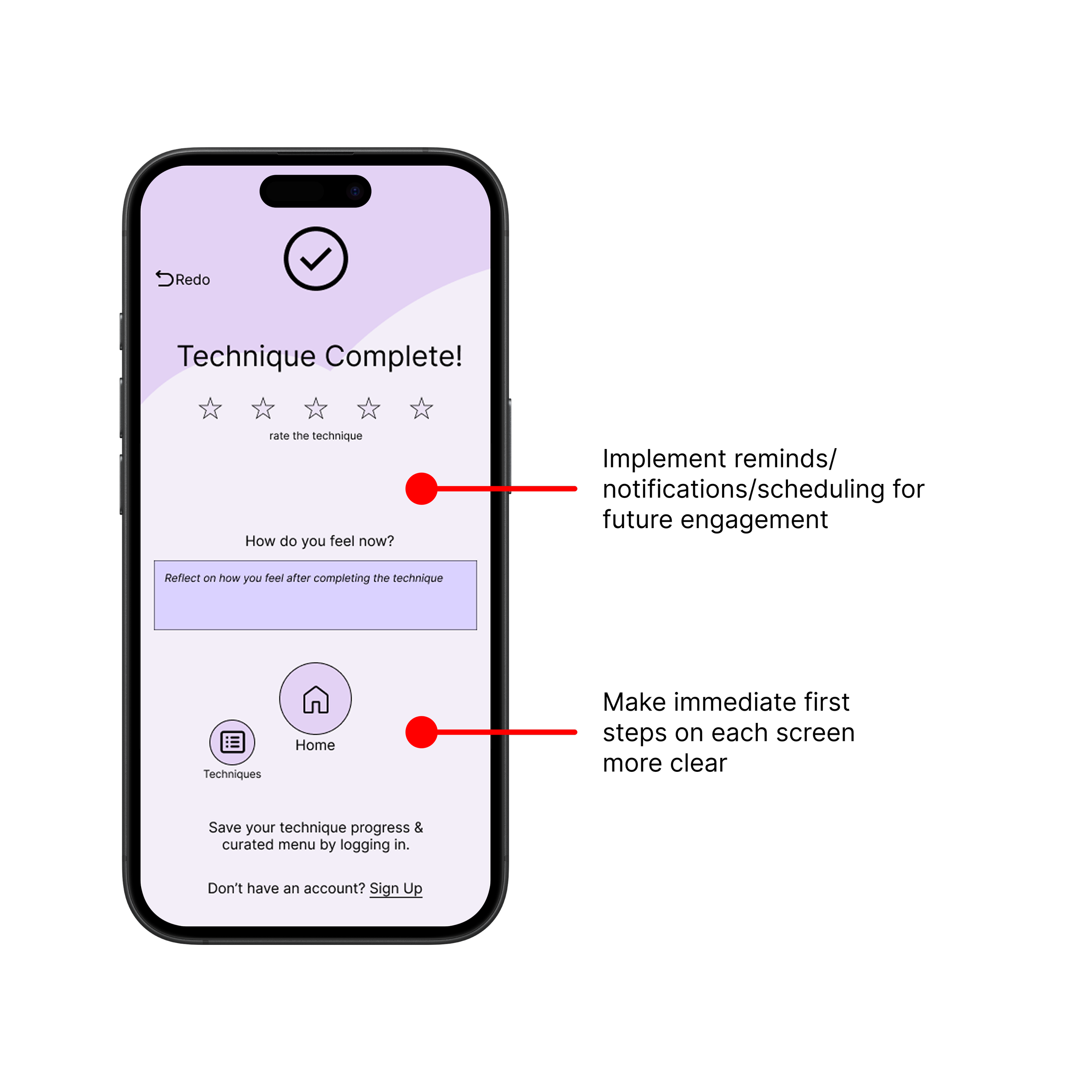
Redesign according to usability testing insights
Adjust UI elements (text, button sizes, etc.) for accessibility
Increase visual aids & statistics for proof & trust
Features to implement
Notification/scheduling - Boosting engagement
Progress tracking - Visual record of what does/doesn't work over time


