Dropping Wisdom with Santos Podcast
a community networking podcast
Website Design
Role: Solo Designer | Tools: Figma, Podpage | Timeline: 4 weeks
Users
Podcast listeners (new and returning) plus potential guests looking to learn about the show, listen quickly, or apply to be featured
Deliverable
A Podpage-based podcast website with a listen-first homepage, episode browsing, and a streamlined guest intake form synced to Buzzsprout via RSS automation
Problem
The podcast needed a clear, professional home base that reduces friction to listening and stays updated without manual website maintenance.
Overview
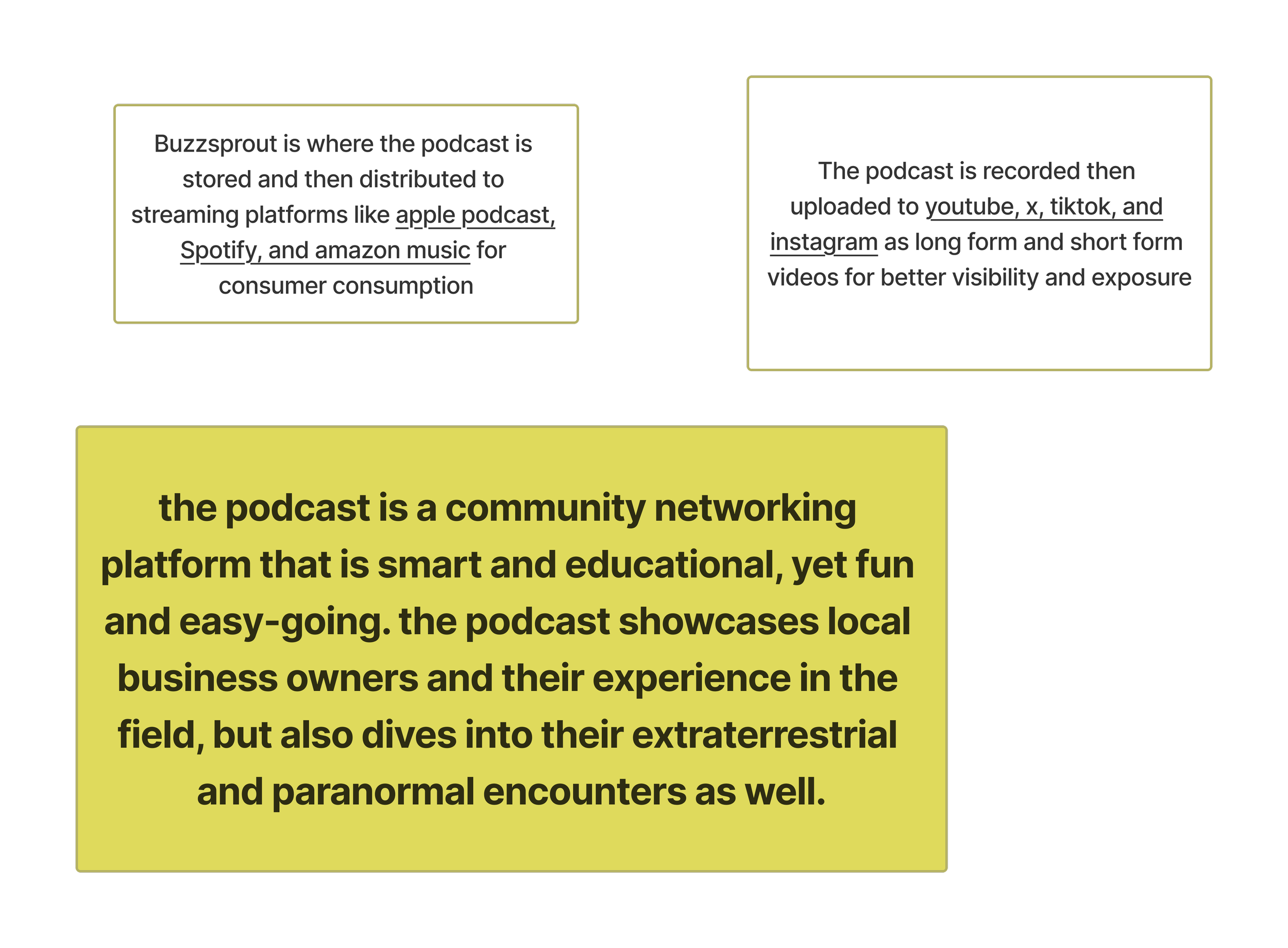
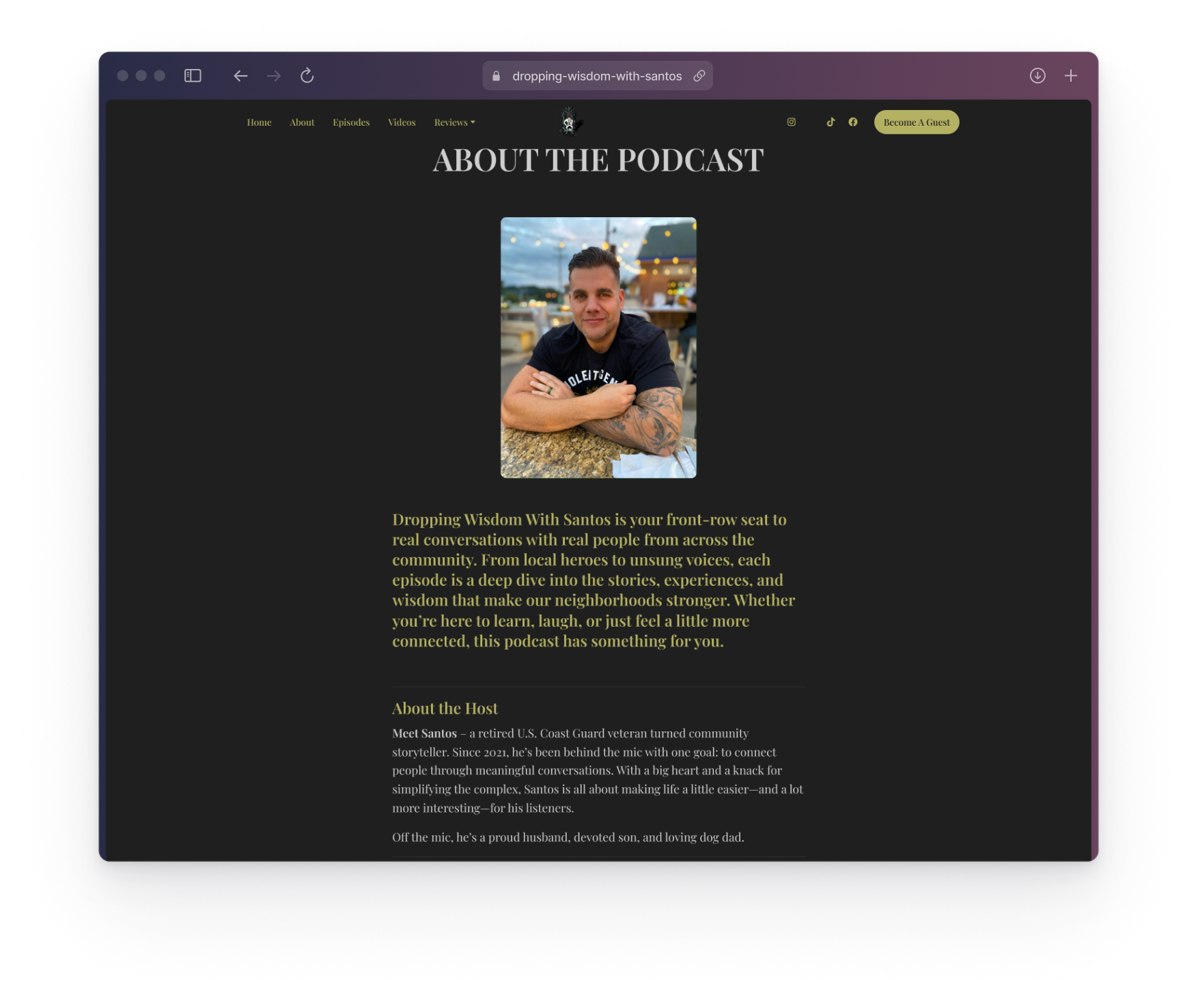
Dropping Wisdom With Santos is a conversational podcast centered on professional & paranormal experiences tied together with unscripted wisdom. The host wanted a digital presence that reflects the authenticity of his voice while providing listeners an easy way to explore episodes, subscribe, and engage.
The Challenge
Create a modern, lightweight podcast website using Podpage, fully integrated with Buzzsprout, while working within Podpage’s design limitations.
Project Goals
Understand the show’s tone, audience, and content themes
Develop a visual identity and structure through mood boards & sitemaps
Build a workflow that keeps the site updated automatically using Buzzsprout feeds
Develop a Podpage-based website that feels custom despite template constraints
The Design Process
Designing the podcast’s website was a balance of visual limitations and client accessibility. I had to find the perfect middle ground so that my client could easily configure the site post-delivery while also creating an experience that best represented the product’s values.
Discovery & Understanding
Structure & Style
Client Workflow Sync
Development & Launch
Discovery & Understanding The Podcast
I started the project by talking extensively with the client to get a strong understanding of the podcast, it’s listener, guests, and more about the host himself.
Santos wanted a platform that:
Matched the smart yet relaxed style of his podcast
Made it easy for new listeners to browse episodes
Offered plenty of opportunities for navigation to his other platforms
Required minimal upkeep and automated publishing tasks
Listeners
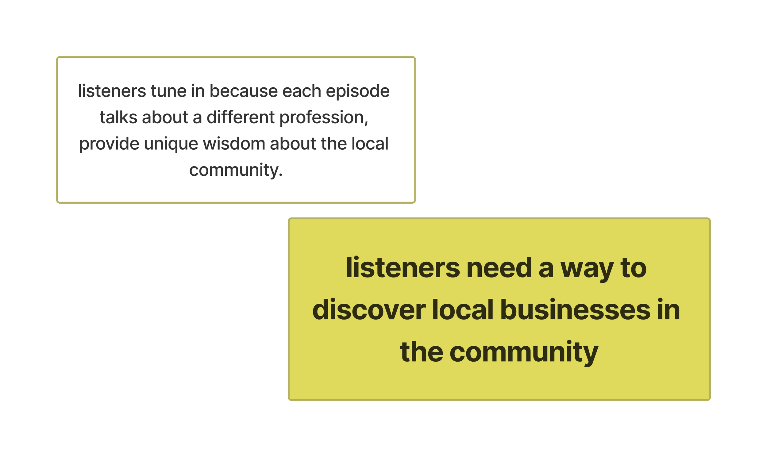
Interested in self-improvement, community, and local business
Seeking network connections and relatable life experiences
Enjoy the unique perspectives of each episodes
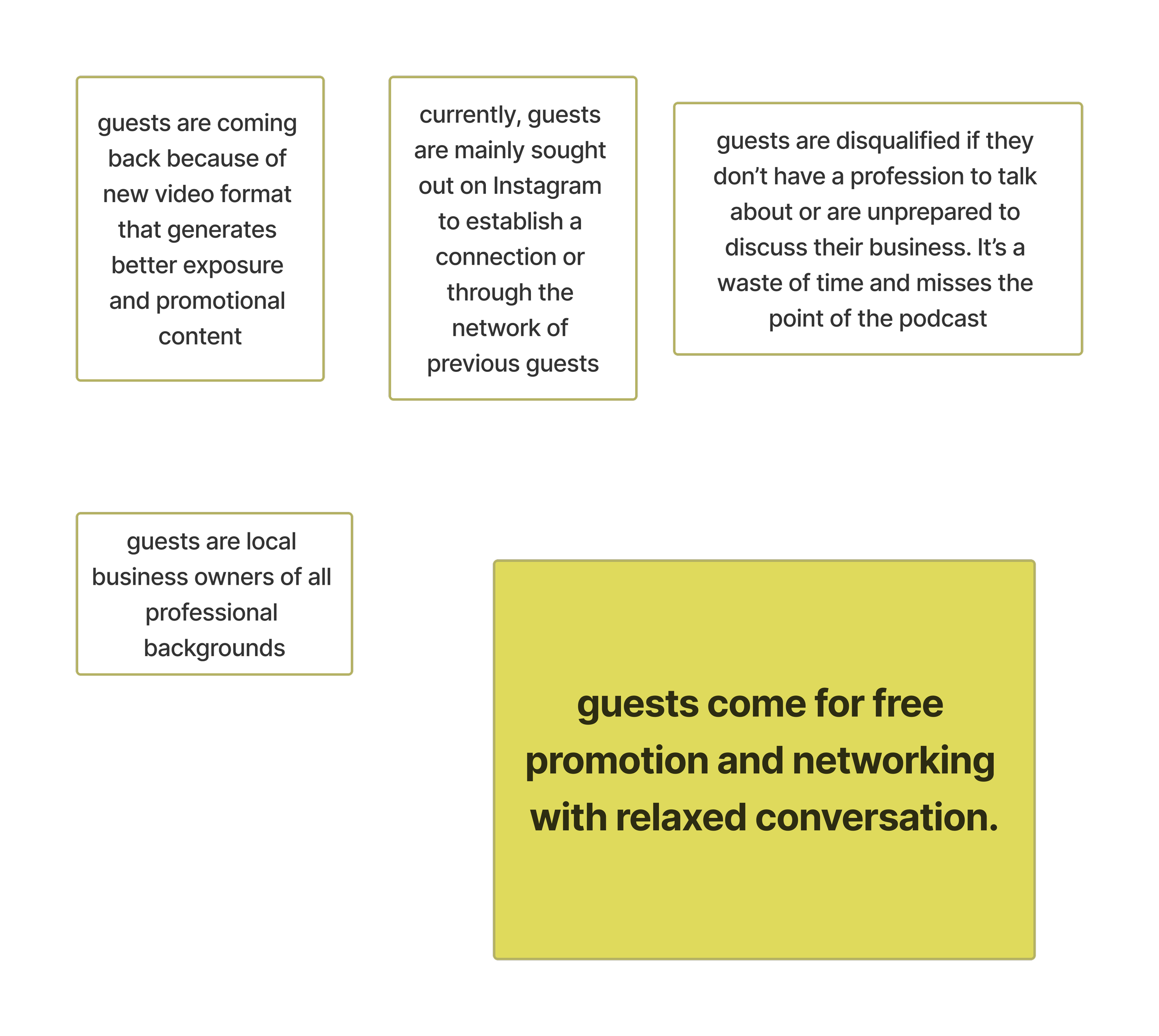
Guests
Local business owners
Interesting in promotional content & exposure
Want to further connect with the community
Style
Smart & relaxed feel
Feature paranormal/extraterrestrial aspect
Minimalist layout

exploring style
At the early stage of the project, I created a mood board to explore the emotional tone, thematic direction, and visual identity of Dropping Wisdom With Santos. The goal was not to define final brand decisions, but to establish a shared understanding of the podcast’s personality and narrative before moving into structure and layout.
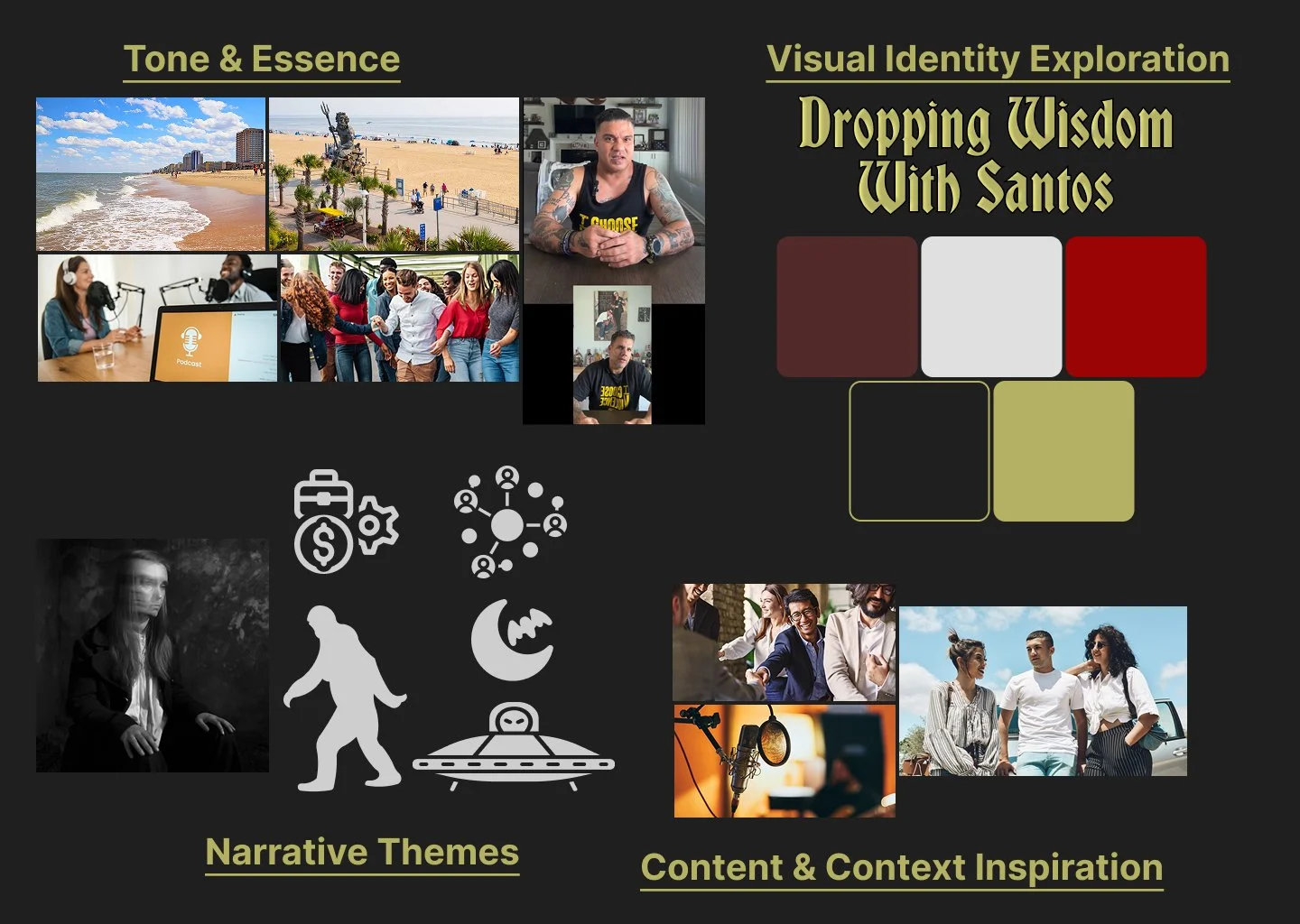
Narrative Themes
The podcast often touches on curiosity, unconventional ideas, and the unknown, so I separated a “Narrative Themes” section to capture that secondary brand layer without overpowering the core community tone. The iconography and moody imagery informed subtle design cues—darker backgrounds, atmospheric accents, and a slightly mysterious edge—used sparingly to support the show’s voice while keeping the overall site welcoming and accessible.
Content & Context Inspiration
I used content and environment references to keep the design grounded in how listeners actually experience the podcast: audio-first, conversational, and social. This influenced layout decisions like emphasizing Listen Now actions, making episodes easy to browse, and ensuring the site supports a sustainable publishing workflow (new episodes can appear cleanly and consistently as content grows).
Visual Identity Exploration
Early typography and color direction to translate the tone into a repeatable UI language. The palette balances depth and warmth (maroon/red) with stability and readability (charcoal/gray), plus an earthy accent (gold) to keep the brand feeling grounded and mysterious rather than overly flashy.
Tone & Essence
Community-driven, conversational, and rooted in Santos’s real-world environment. The beach and local imagery reinforced a grounded feeling, while the group and studio photos emphasized human connection and an approachable, talk-first vibe.
Establishing Structure
To move from visual direction into a functional layout, I sketched an early sitemap laying out the homepage. At this stage, the goal was to establish content hierarchy, identify key user touchpoints, and confirm the minimum content needed for a strong first release.
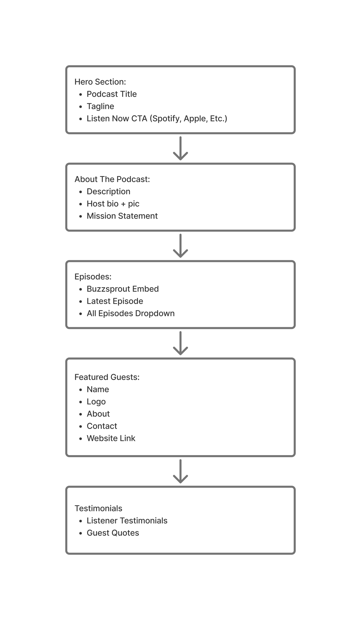
Hierarchy Strategy
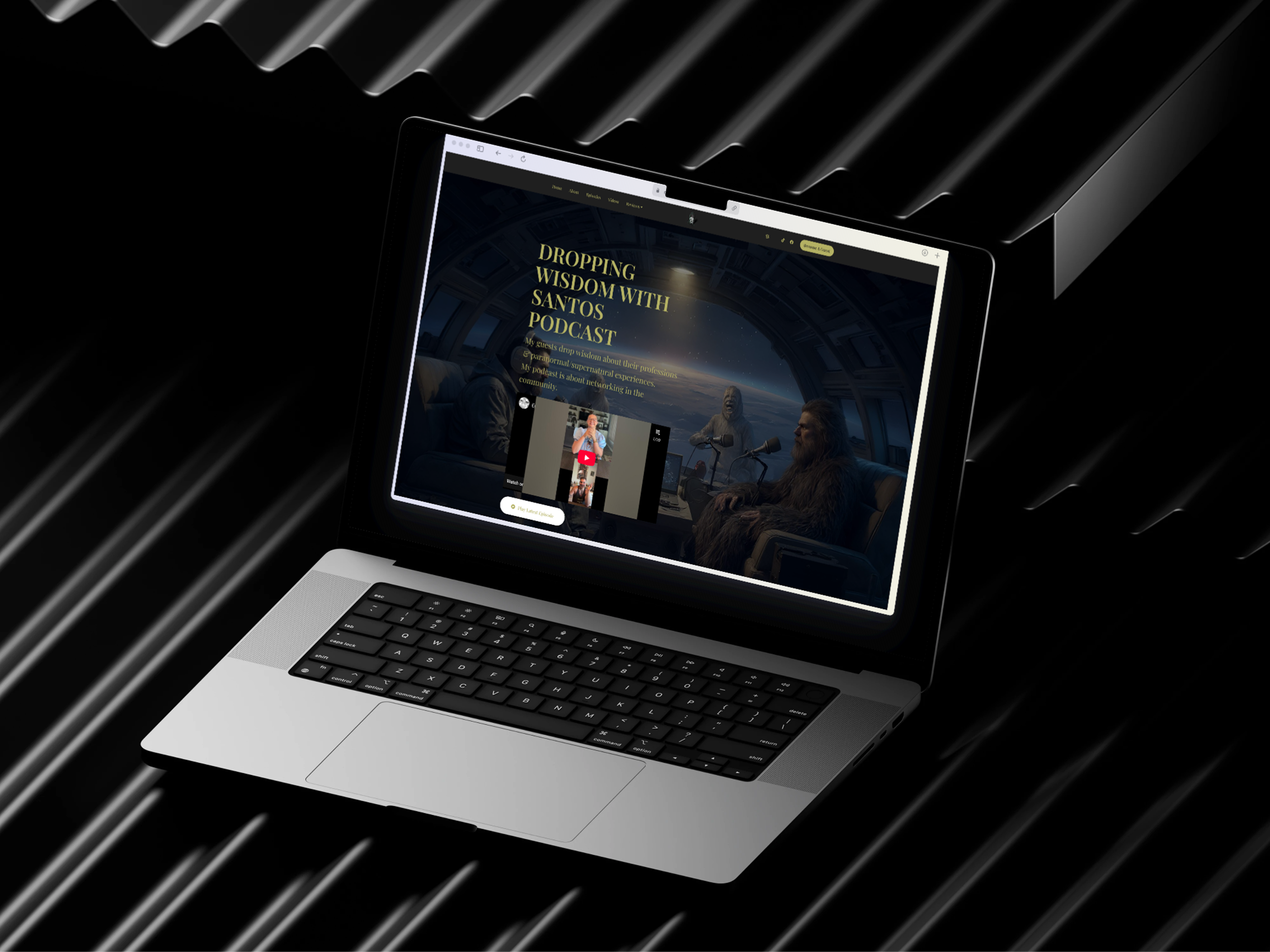
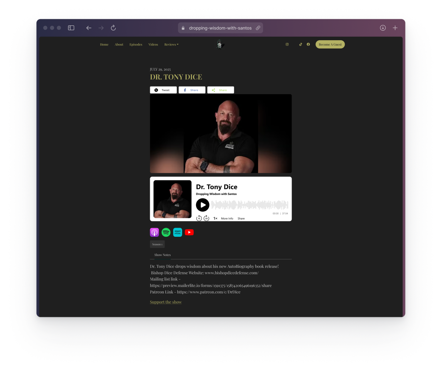
Hero Section - Primary Conversion Point
Designed to answer “What is this?” and “How do I listen?” within seconds
The site’s primary touchpoint for first-time visitors and social traffic
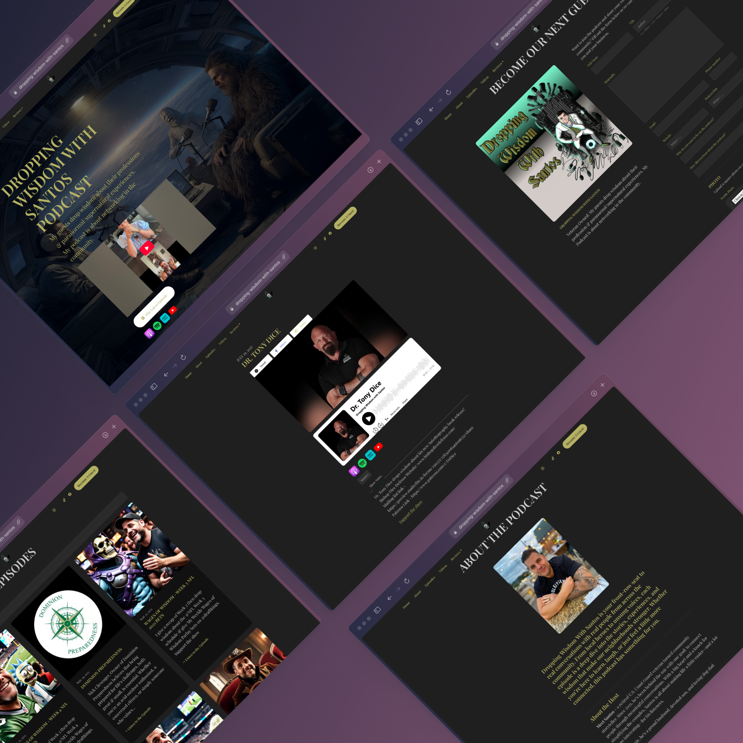
About the Podcast - Trust & Context
Builds credibility and connection early
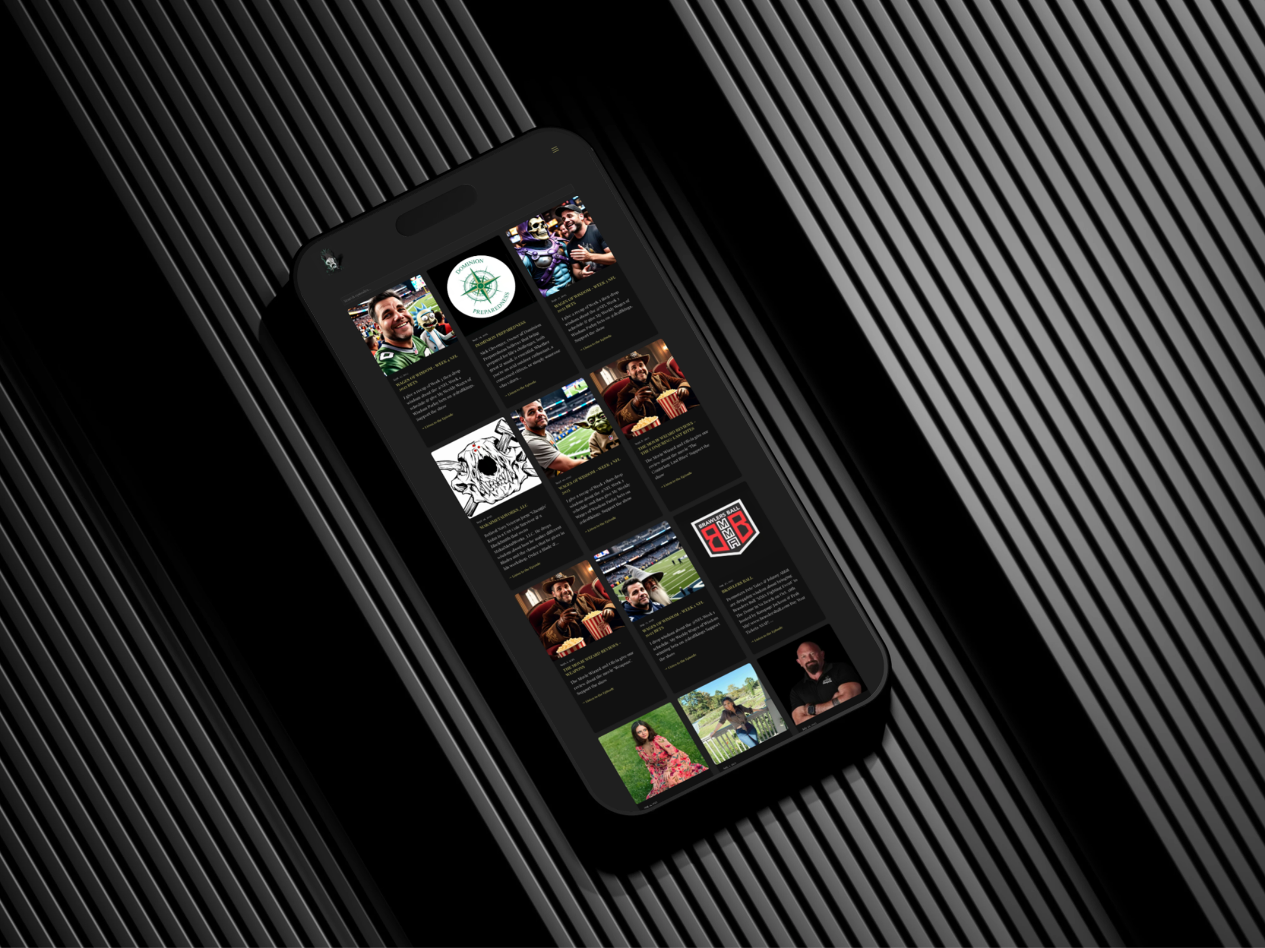
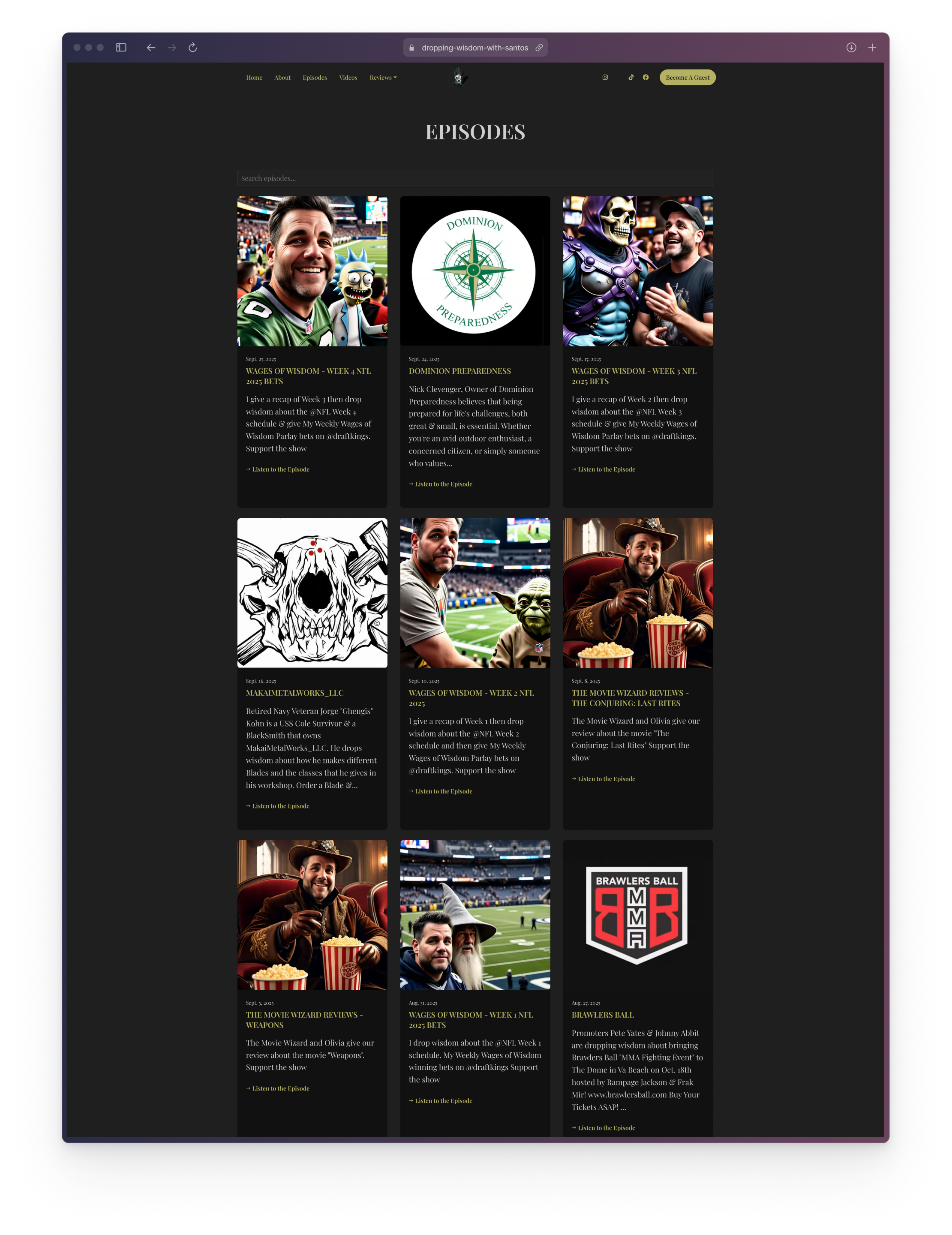
Episodes - The Core Experience
THE product
Structured to prioritize quick access to the latest releases and a clear path to the full archive
Began to explore Buzzsprout’s RSS feed implementation for easy maintenance and automation
Featured Guests - Social Proof & Discovery
Supports discovery and credibility, especially for visitors arriving from guest referrals
Testimonials - Reinforcement
Placed last as reinforcement for users who scroll and want validation.
Listener and guest quotes strengthen trust while keeping the top of the page focused on listening and episode discovery.
Client Alignment
After defining the visual direction in the mood board and outlining the homepage hierarchy in the early content structure, I created a mockup to align with the client before committing to anything. The goal was to validate that the design matched the podcast’s tone and that the content order supported the primary user journey.
Mood Board Translation: I applied the dark, high-contrast foundation with warm accent colors to reflect the podcast’s grounded tone with a subtle edge of mystery. Supporting iconography reinforces the show’s paranormal/supernatural themes without overwhelming the content.
Hierarchy Translation: The layout follows the planned scroll flow so each section plays a specific role in moving the visitor toward listening or engaging.
Outcome + Feedback
The mockup review served as an alignment checkpoint to confirm what resonated and what needed refinement before moving forward. The client feedback clarified both brand tone and content priorities, resulting in the following iterations:
Visual Direction Updates
Redesigned palette: The client responded well to the gold/black direction but did not like the heavy use of red. I redesigned the core palette to better align with the brand’s cool spacey vibe while keeping the interface high-contrast, premium, and maintaining readability.
Incorporated the client’s logo: The design was updated to use the existing logo.
Refined typography: I replaced Bradley Gratis with Cinzel to improve accessibility. Cinzel maintained the brand’s dramatic tone but provided stronger clarity and readability.
Spaceship podcast studio: The client wanted the site to feel like the podcast was “broadcasted from a spaceship” so I began exploring more atmospheric treatments to support that narrative without distracting from the content.
Removed icons: The icon style felt immature, so I shifted away from playful clip-art style elements and toward cleaner, more mature visual motifs to better match the brand’s desired tone.
Content Structure Changes
Removed Featured Guests section: This was redundant since guests are inherently highlighted through episodes. The homepage flow was simplified to keep focus on listening and browsing.
Simplified guest intake form: The original form was reduced to collect only essential information, lowering friction and making it easier for potential guests to submit requests.

Result
This feedback tightened the project direction in two key ways: it clarified the desired brand atmosphere (premium, black/blue/gold, “spaceship studio”) and streamlined the site to focus on the most important user actions (listen and engage) without unnecessary sections or visual distractions.
Platform Selection
After validating the homepage concept with the client, I evaluated multiple site builders to choose the platform that best supported the podcast’s long-term publishing workflow and maintenance needs.
Key decisions
Prioritized automation over full visual freedom
Why: A podcast site must stay current as episodes grow, and the client needed minimal upkeep.
Used workflow-based criteria to compare platforms (Squarespace, Wix, Framer, Podpage)
Why: General builders can look great but often require manual episode updates without extra systems.
Selected Podpage for Buzzsprout RSS syncing and podcast-specific features
Why: Podpage supports auto-generated episode pages and feed-driven updates.
Impact
Reduced ongoing maintenance by enabling a “publish once in Buzzsprout → site updates automatically” workflow.
Established realistic implementation constraints early so design choices stayed scalable and builder-ready.
Design Implementation
With direction aligned, I translated the approved mockup into a builder-ready design plan, refining visuals and content hierarchy based on feedback while keeping the experience focused on listening and discovery.
Key decisions
Maintained a listen-first hierarchy (Hero CTA + episodes as primary touchpoints)
Why: Listening is the core conversion action for most visitors.
Simplified the homepage by removing Featured Guests
Why: Guests are inherently highlighted through episode content, making the section redundant.
Shifted visual direction to match feedback (gold/black preference, integrate logo, “spaceship studio” vibe)
Why: Reinforced brand personality while keeping the UI mature and cohesive.
Refined iconography (reduced playful/childish elements)
Why: Improved perceived professionalism and brand fit.
Improved typographic clarity (Bradley Gratis → Cinzel)
Why: Increased headline legibility and cross-device readability without losing character.
Reduced guest intake friction (essential fields only)
Why: Lower effort increases completion likelihood.
Impact
Cleaner, more focused homepage that supports quick understanding, fast listening, and scalable growth.
Visual language aligned to the client’s tone while staying realistic for implementation constraints.
Final Design and Handoff
The final step focused on delivering a site the client could operate confidently—supporting automated episode publishing, simple content edits, and consistent presentation as the show expands.
Key decisions
Defined a sustainable publishing workflow (Buzzsprout RSS → site updates)
Why: Eliminated the need for manual page creation and repeat updates.
Provided lightweight management guidance for ongoing edits
Why: Ensured the client could maintain the site without design support.
Documented consistency rules (typography, colors, section usage)
Why: Prevented visual drift as new content is added over time.
Impact
The client can keep the website current by publishing in one place (Buzzsprout), while the site stays updated automatically.
Clear handoff guidance reduces maintenance overhead and supports long-term brand consistency.